i can't stop. send help?

yup. i guess we're (i am) doing this. at least until i run out of steam.
my aim for the moment is this chapter, which has ~120 pages and a bunch of uniform tables/data. i guess i've made it 10% of the way already. :v
right now i'm working in a tic-toc fashion: rough out some pages in an ad-hoc way to find out what i need, then clean things up introducing macros etc., then repeat.
#troff #typesetting #commodore #c64 #assembly #neoretrocomputing
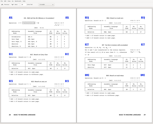
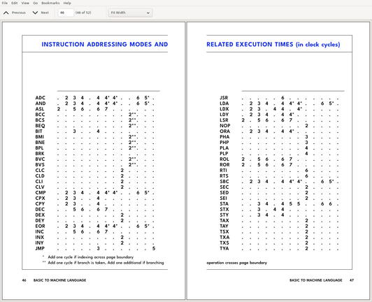
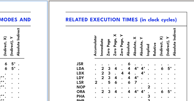
some nice progress. i've made it into the instruction tables. they are full of quirky stuff, just look at those little devils...
took a bit to set up the macros for things, but after that it got pretty nice to work with. now of course i have about 12 pages more of this to type, and they have some new weirdness in them... *sigh*
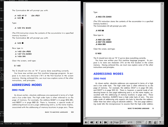
got the rotated text done yesterday. bah, it was difficult! and I don't even really know why. it's not a standard feature of #troff, so one has to inject some raw postscript in there. this should all be simple, but aww, there were some weird interactions. yet i made it, it works, so there.
also did the proof-reading on these latest parts, found a few small mistakes. i still need to do one (easier) table, and then i'm done with the first major part of the chapter, ca. 50 pages, 40%.
i think i'll actually print that out and try binding it into a booklet, as a trial.
i could use feedback on this.
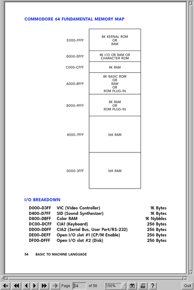
while i reproduce a lot of things in somewhat embarassingly close detail, one thing i am not at all wedded to is the IMHO atrocious typesetting of tables in the original programmer's guide.
i'm confident this one, for instance, does not need internal vertical rules. in fact, no vertical rules at all?

done! still haven't decided whether to add the "prison bars" or not. but managed to replicate the original's page and line breaks pretty exactly. this needed just a few tweaks here and there.
i had a choice to make here: arrange it so that every item ends up in the same place on the same page as in the original, even if a bunch of it doesn't make any sense?
i decided to do so. the benefit would be that someone familiar with the original table (which i am guessing is a few people), for all its terrible layout, would not be confused by looking at a different table that would still have had pretty bad layout.
so any changes made to the table cannot change the relative positions of things, unless or until i rebuild the whole damn thing as part of a (hypothecial) larger effort.
there are a few errata items that can be fixed without changing the layout. not in this first edition, though. keeping all the typos and stuff, so i can make a clean diff just for them.

PS:
Total length of the document is 126 pages (all of chapter 5). I have not tracked time exactly, but it took more than 60 and less than 100 hours, spread across 4.5 weeks in a three month period: 3 weeks starting at the end of march and another 1.5 now.
Overall I am satisfied with this, given the variation in layout involved. Significantly less than an hour per page on average, which is what I was aiming for. For reference, the final pages of tables took about 10 minutes per page to type up, less when there was copy/paste involved.
What took long was of course overhead in setting up macros for some particular structure, and wrestling troff when there was some wrinkle. On the latter, I did like working with troff, but there were a good number of frustrating moments when it behaved differently from what I expected and I had to puzzle out why and/or how to work around it. I got the feeling that there were some leaky abstractions going on and sometimes I just didn't have the full picture of how it actually operated under the hood.
Anyway, still have to make a title page and then I'll have to put the PDF up on the web somewhere, I guess! :)

@alerque i actually have three branches:
1) replicate the original, including obvious mistakes and typos. some variation in layout allowed, 80/20 best-effort.
2) fix (only) the typos and mistakes.
3) more substantial improvements, incl. wording, layout, etc.
so right now i am working on track 1, leaving comments for 2 and 3 having done only a few beginnings on those.