Please stop with the floating elements on websites. They're hiding your content, and make me want to leave!

No, I don't want to "swipe to the next article" if there's also gonna be a giant floating arrow hiding the text and make me want to stop reading the one I'm painfully trying to read right now.

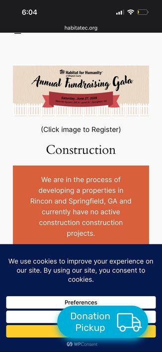
No, I don't want to "donate" if I can't even fully read what your organization is about because of all those buttons floating over your content.

The goal is to show your content! Why hiding it with a bajillion arrows, buttons, and popups? And please test your website for small mobile display. Your floating elements are ENORMOUS there 😭

#WebDesign

@Em0nM4stodon No, their goal is not to show their content. They don't give a shit whether you read their content or not. Their goal is to make money, by whatever means.
@TimWardCam Agreed, although I don't think this is serving their goal of making money either, which usually requires at minimum people stay on the website and share links to it.
@Em0nM4stodon If competently done (which I agree is a bit of an "if") they'll have numbers which support the way they're doing it.
@TimWardCam @Em0nM4stodon At best the numbers will reflect wrong proxies for short-term profit/exits and ignore everything relevant to running a healthy profitable business.
@Em0nM4stodon absolutely right - those floaters and popups are a real nuisance. I close sites like these immediately.
@energisch_ @Em0nM4stodon And this is one of the reasons why one of the first sites to make me want a paid subscription is wheresyoured.at
@energisch_ @Em0nM4stodon You've read half a paragraph of this blog. Do you like it so much already that you'd like to subscribe to an email newsletter?

@Em0nM4stodon
Because annoying internet search and web pages are causing my stress levels to rise, I'm finding myself at the library more often

edit for clarity

@Em0nM4stodon and vice versa, please also test on desktop, I want more than 3 lines of text per screen thanks
@GuillaumeRossolini Oh gosh yes, some websites on my 5k display have buttons as large as the moon!
What Is a Dickover?

dickover — a modal panel, popover, or curtain presented by a website or app, deliberately obscuring its own content to frustrate the user with an unwanted, unnecessary, mandatory interaction; e.g. asking the user to accept “cookies”, subscribe to a newsletter, install the website’s mobile app, agree to terms of service, or anything else that the user couldn’t give two shits about.

Daring Fireball

@Em0nM4stodon

I've never done web design, but I've always had this thought in the back of my mind that not all of these sites have a legitimate need for JS, or at least not on every page.  It seems like a lot of them could've been plain HTML+CSS and been fine.

@plutarch Indeed. I have done quite a bit of web design and I agree. All my websites only use HTML+CSS. For a basic website presenting images and text it's all you need. It's also much easier to maintain.

@Em0nM4stodon @plutarch exactly, i was a professional web developer, you dont need 90% of the utter crap sites load these days, the "frameworks" are totally nuts. These things all try to turn a simple "page" into an event driven gui app.

When I write stuff these days I avoid such BS, You rarely need javascript IMO, only for complex things like web based maps.

Motherfucking Website

User Inyerface - A worst-practice UI experiment

User Inyerface - A worst-practice UI experiment

@Bredroll @Em0nM4stodon @plutarch When I first started surfing the WWW on Lynx I was absolutely disgusted by corporate sites that didn’t have any content at all until you loaded all the pictures. There haven’t been a lot of additions since maybe frames that actually made the web better than what you could show on a text-only interface. Maps and maybe video services are about the only exceptions, and they’re more heavy-duty than most websites need. I do enjoy my inline illustrations, but I could do that with pure html in 1998.

@Em0nM4stodon @plutarch Yay, #NoJS gang rise up! Figuring out JS-free alternatives to common website features is so much fun. :) I recently came up with a JS-free tag filtering system and a JS-free footnote-on-mouse-hover feature for my website, and had an absolute blast resolutely ignoring all those tutorials out there telling me to just use JS.

As for pop-overs, I have a personal rule that I’ve been following for the last few years: any website that bombards me with multiple popups (or hijacks my scroll wheel) is added to my Shit List and never gets visited again. I begrudgingly stick around on websites with cookie pop-ups if I like the site (but always can’t help wondering “couldn’t you just … NOT use cookies and analytics tracking, and then not have to annoy me with this pop-up?”)

@plutarch @Em0nM4stodon

"Not all" is the understatement of the year. Hardly any. If you only provide information, instead of an interactive service you don't need JS. Fullstop.

(And yes, this sometimes means adapting to the medium instead of developing a "design" in a drawing program and then porting it into a website).

@glitzersachen @plutarch @Em0nM4stodon 100%! And I would also add that there are plenty of interactive features that can also be managed without JS. For instance, if you search “how to make footnotes appear on mouse hover” virtually every tutorial you find out there will tell you to use JS/JQuery. But you can absolutely do it with clever use of HTML and CSS alone.
@Em0nM4stodon this, but also Gnome and Material You. Give me menu bars PLEASE

@Em0nM4stodon

⬆️ This! All of this!!! ⬆️

Especially these popups...

"Please sign up to our email newsletter"

and...

"Please donate"

@TCMuffin @Em0nM4stodon Is it not normal to be overwhelmed by your email box?! Like how do people think more email is wanted?!

@Em0nM4stodon

You may appreciate this then (if you haven't already seen it): https://daringfireball.net/2026/05/what_is_a_dickover

What Is a Dickover?

dickover — a modal panel, popover, or curtain presented by a website or app, deliberately obscuring its own content to frustrate the user with an unwanted, unnecessary, mandatory interaction; e.g. asking the user to accept “cookies”, subscribe to a newsletter, install the website’s mobile app, agree to terms of service, or anything else that the user couldn’t give two shits about.

Daring Fireball
@jon It's awesome 😁
@Em0nM4stodon omg yes. I took this screenshot recently of a nonprofit’s site. They have the “do you want cookies?” pop up, but then a floating button to make a donation over it. Can’t do anything on the site before making a cookie selection, but can’t do that because of the button.
@Bfordham Oh no 🫣🤦‍♀️
@Em0nM4stodon right? And I pulled up the link from their newsletter because I wanted to learn more about their gala. I wonder how many people did the same on their phones?

@Bfordham @Em0nM4stodon

They seem to really like the word "construction" 🤪

@Em0nM4stodon
> And please test your website for small mobile display. Your floating elements are ENORMOUS there 😭

Say it louder!

@Dracan @Em0nM4stodon this type are my favourite 😕
@kaosk @Em0nM4stodon
I see such bullshit for the first time ever but i already hate it. :3
@Em0nM4stodon Preferrably also test your website on a Linux small screen touchscreen device like a PinePhone running a desktop browser like Vivaldi or LibreWolf at 100% screen zoom.

@Em0nM4stodon This annoys me so much! I've started mucking around with a bookmarklet that removes all fixed, sticky and absolutely positioned elements and some other things.

I resent every time I have to use that bookmarklet though.

@Em0nM4stodon Whatever your idiom is (Desktop, mobile, web), there are very few legitimate reasons to throw a popup in your user's face. It's lazy design in the best case, deliberate disturbance in many cases. Devs should apply to a court to be granted the right to use popups per case. Or we should have a Nüremberg of the illegitimate uses of popups. Head. Spikes.

@Em0nM4stodon Sadly, more websites are fighting a losing battle with mobile, and forcing 'surprise' stimuli to gain more attention, and perhaps more revenue.

It's a losing battle, with more apathy developed, and more common causes ignored, because of this kind of conditioning.

Modern behavioral science is even losing out on this one.

@Em0nM4stodon

I've never understood the annoying "strobes & sirens" design concept behind such practices.

Cory Doctorow points out that it's a design choice intended to falsely amplify clicks for the fat-fingered economy. Advertisers & readers get cheated using such tactics.

https://doctorow.medium.com/https-pluralistic-net-2025-05-02-kpis-off-principal-agentic-ai-problem-e7ed8810a990

https://pluralistic.net/2022/05/15/the-fatfinger-economy/

https://www.wheresyoured.at/the-men-who-killed-google/

I used to just print the article just to read a static version without the visual distractions but the print icon has been removed.

AI and the fatfinger economy

Every slip of the finger is money in the bank.

Medium

@Em0nM4stodon

Should be illegal on mobile options, overlaps functional buttons, is maddening

@Em0nM4stodon I don't see those - I use ad blockers.
@liberloebi I too use an adblocker, but it doesn't hide floating buttons.
@Em0nM4stodon Oh? I have never seen them, so I thought…
@Em0nM4stodon adversarial user interfaces seem to be ascending. No idea why anyone thinks it is a good idea.

@Em0nM4stodon
You don't even need a mobile!
Simply make your browser window small.

You'd thank after approximately 30 years of CSS and 35 years of web sites that people could build useable ones.

But look at Win10/11. Garbage GUI compared to Windows NT 3.51 with the Explorer preview shell in 1995.

Or Android.

I'm using Mint + Mate and a customised Win9x to NT 5.2 (Server 2003) theme. Of course ALL the Web Browsers ignore it and have what I presume is a ghastly Google concept of the UI.

@Em0nM4stodon i have a serious dislike of nearly every modern website, not least the things that load 500mb of crap slowly and rearrange the page the moment you are about to click a link
@Bredroll @Em0nM4stodon its not crap; it's designed to spy on you - get information that can be used in advertisement or for targeting during less peaceful times.

@Bredroll @Em0nM4stodon it's all so unnecessary. I love the people who build fast basic websites. Here is @veronicaexplains talking about building good websites:

https://youtu.be/4_bYUVGgQQo

Another example is Gammers' Nexus

https://gamersnexus.net/

Fast and simple. Another world is possible.

The modern web sucks. My band's website doesn't.

YouTube

@Em0nM4stodon How do you feel about a banner explaining that we don't run ads or trackers on our site and asking you to, if you like what we do, consider donating in Ko-fi? I do this on my company's website and I'm hoping this is OK. It is easily dismissed, which sets a cookie that is only used to not show it to you again with an expiry time of 30 days.

1/2