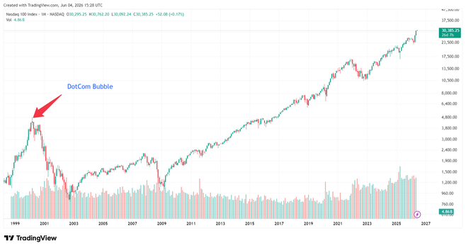
Some perspective:
left: linear
right: logarithmic
looks in fact fairly boring. (sad)
but you can see that the market is slightly overvalued at the moment. a correction is due.
update: ok. i think the reason it looks boring even though the market is irrational is that in the past 3 years, little money has moved *into* the NASDAQ, but a lot of it has gravitated *within* it, like oceans following the moon.

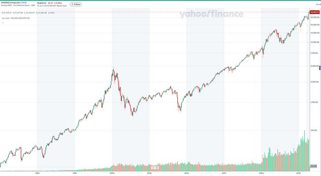
@lritter @TimWardCam "Boring"?! Even on a log scale, I see a humongous bubble that has far exceeded the excesses during the DotCom bubble.
Also, "slightly overvalued", LMAO.
@bontchev @lritter @TimWardCam
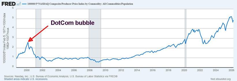
https://fred.stlouisfed.org/graph/?g=1WLdV
Here's Nasdaq Composite/Producer Price Index / population.
Dollars per se are meaningless, this is more or less producer goods per person you can buy with the market cap of the nasdaq
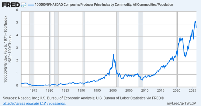
Graph and download economic data for 100000/5*NASDAQ Composite/Producer Price Index by Commodity: All Commodities/Population from Jan 1913 to Jun 2026 about composite, stock market, NASDAQ, indexes, USA, commodities, PPI, inflation, price index, price, and population.
@bontchev @lritter @TimWardCam
Measured in dollars, the current nasdaq is about 7x what its peak in the dot com bubble was... but measured in producer price goods per person, it's about 2x so they aren't the same picture.