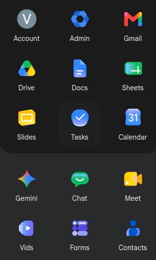
Whoever's promotion was riding on the landing of the new #Google icon revamp needs to reconsider life and perhaps pursue becoming a potatoe farmer.
@vbatts what a drab and uncleart design. Everything looks similar somehow ..
@gbraad @vbatts At least every icon isn't the same colors in the same order any more. Honestly that's a big improvement on its own.

@vathpela @vbatts

Right, but to me that coloring doesn't distinguish them enough for now. It feels all samish...

@gbraad @vbatts you're not going to find me saying google has done a /good/ job (on... just about anything recently). Just that not all the same rainbow is an improvement.
@vathpela @gbraad @vbatts They'll change them all anyway about when you'll get used to these :)
@richlv @vathpela @gbraad and thus the will of the Lord is spoken. And there was much lamentations.

@richlv @vathpela @vbatts

Love the optimism that we will get better ones in future ;-) J/K

@gbraad @vathpela @vbatts Oh no, who said "better"? =)

@richlv @vathpela @vbatts

I was 'very clear' 'better' is not what I foresee in it's future. There was "J/K" added ;-)

Noted I should add more smileys in future. As I am sure this redesign will happen again.

@gbraad @vathpela @vbatts Yes, I got that, and I tried to continue the sarcasm without it being too confusing, and probably made it too obvious, so - good fun? =)

@richlv @vathpela @vbatts

Google is always good fun. they provide a life-time of joy and ridicule ;-)

@richlv @vathpela @vbatts

Example; how long until "Antigravity" comes falling down like a brick! I do not give it much ...