Hey kid, wanna buy some graphs? 🥸
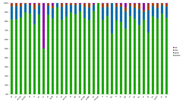
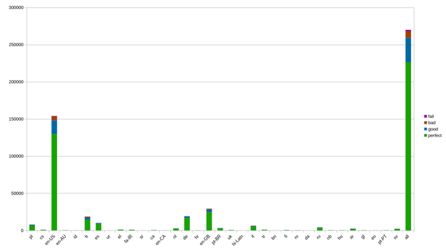
This is how the google library performed on batch 1 of #heliboard data.
I didn't have these graphs before now, just got the testing harness to spit them out. (Progress! Needs more testing though.)
Right now, they are CSVs I load into calc; I am going to have these, and 70 other graphs, generated by a python script soon.
perfect = top suggestion
good = on the suggestion bar
bad = long press for suggestion
fail = user had to force accept gesture