 ARGVMI~1.PIF
One neat thing about #GNOME #Web (the browser formerly known as #Epiphany) is that, if you make the window really small—that is, about the size of a phone screen—the browser controls will change to a minimal phone-like appearance!
I figured this behavior was inherited from #Safari, but I happen to have a Mac in my possession at the moment, and no, desktop Safari doesn't do this. Just GNOME Web.
Interesting.
Was GNOME Web specifically designed to work without modification on phones?
 Jeff Fortin T. (風の庭園のNekohayo)
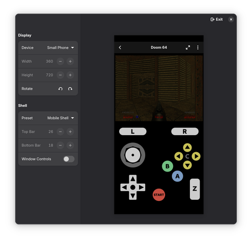
 Akseli
 Victoria 🏳️⚧️