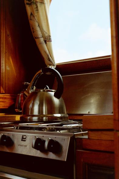
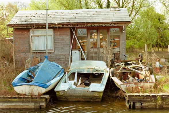
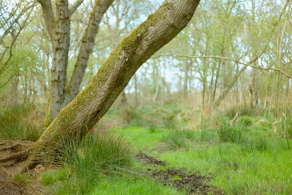
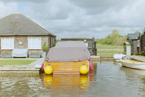
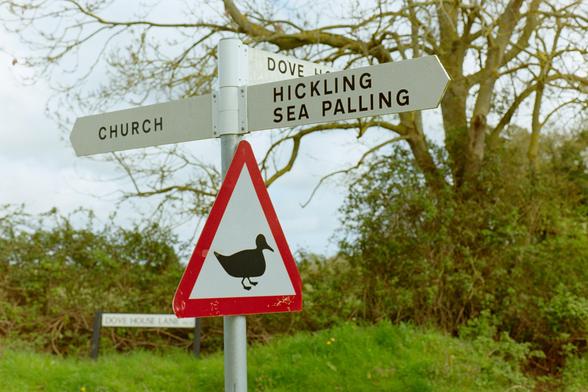
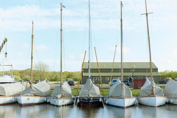
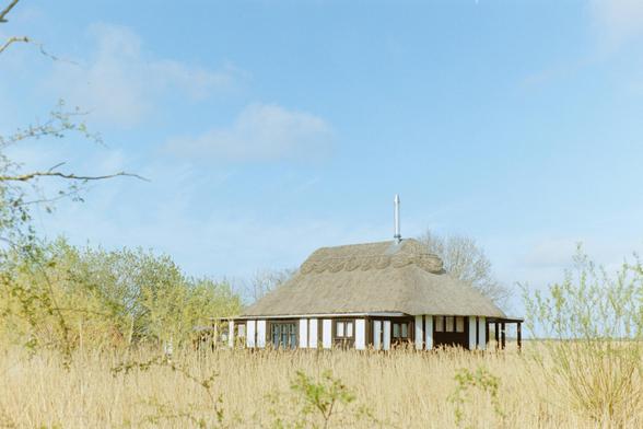
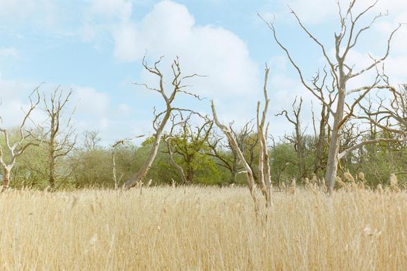
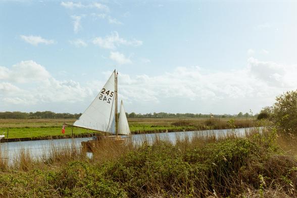
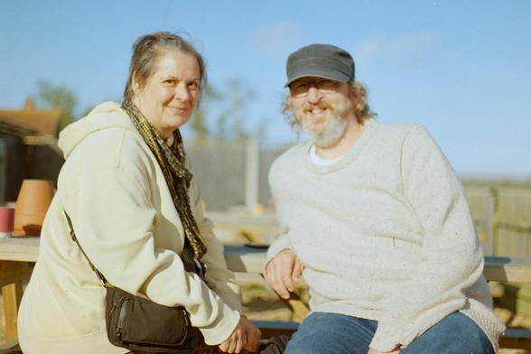
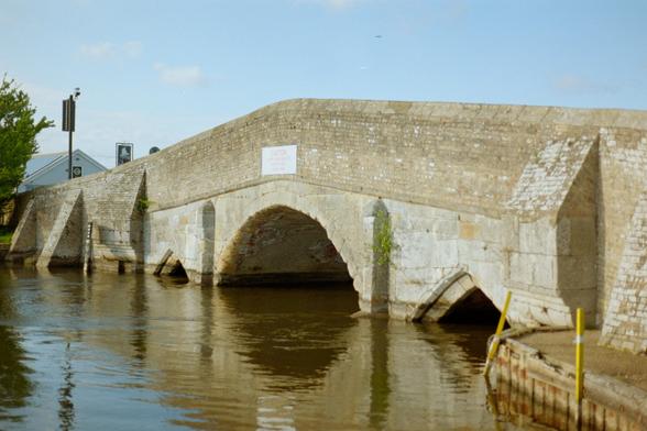
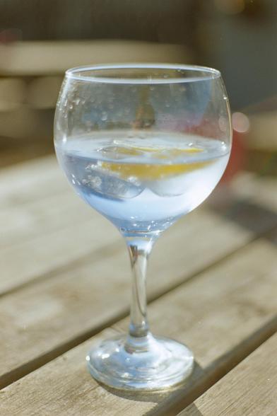
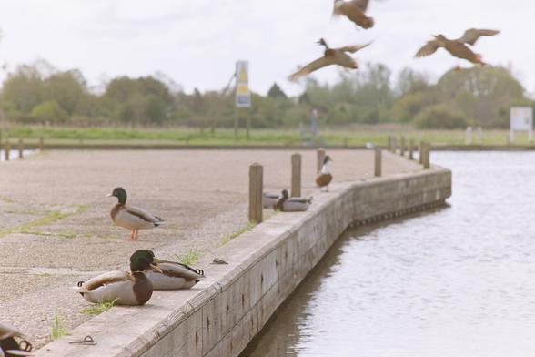
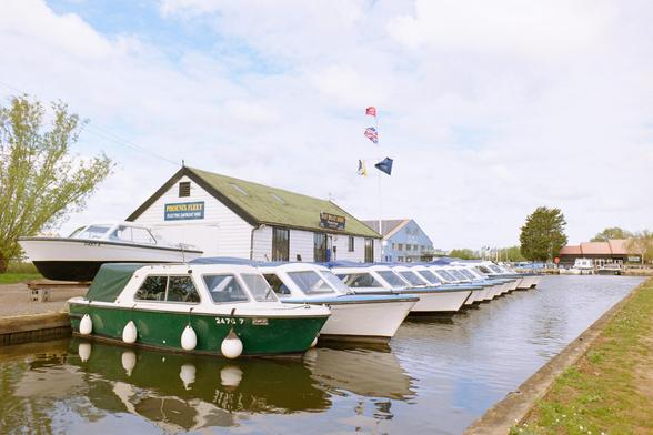
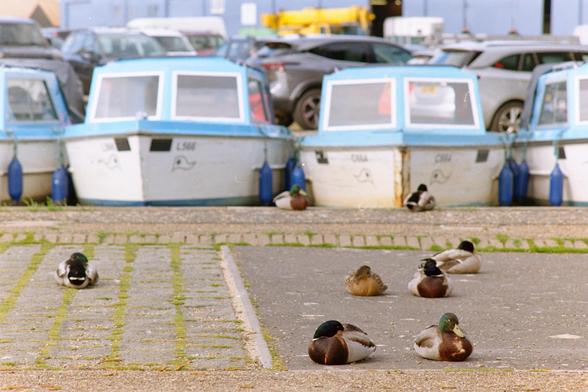
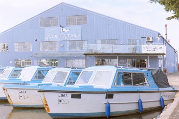
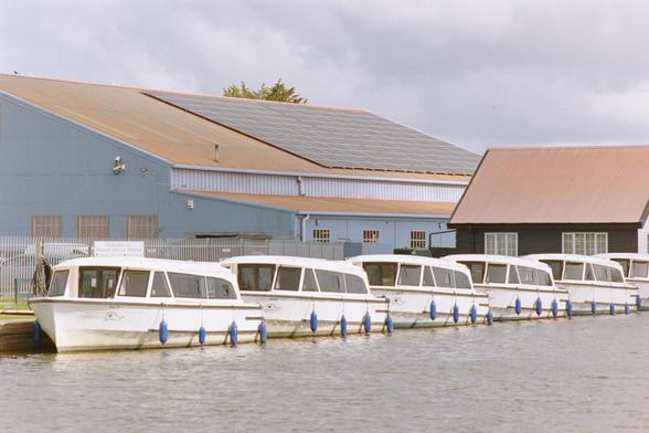
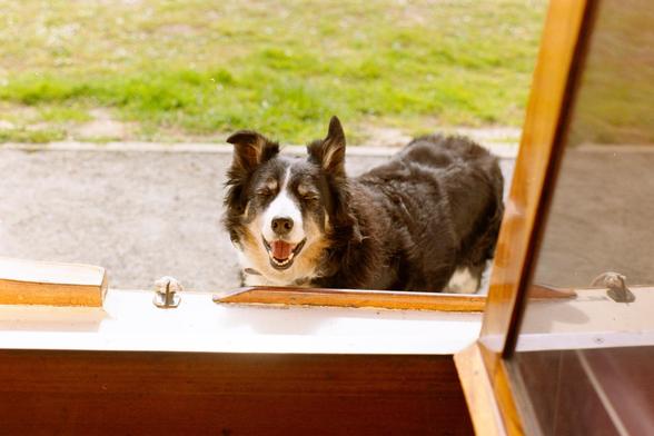
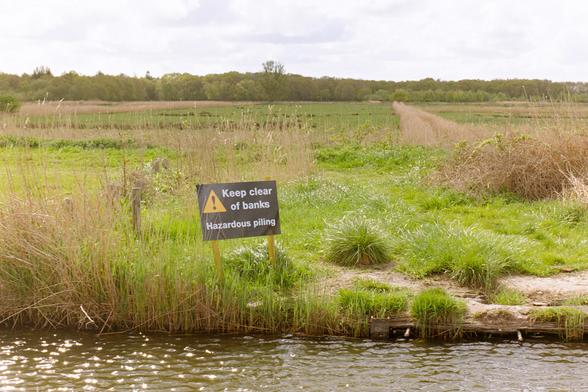
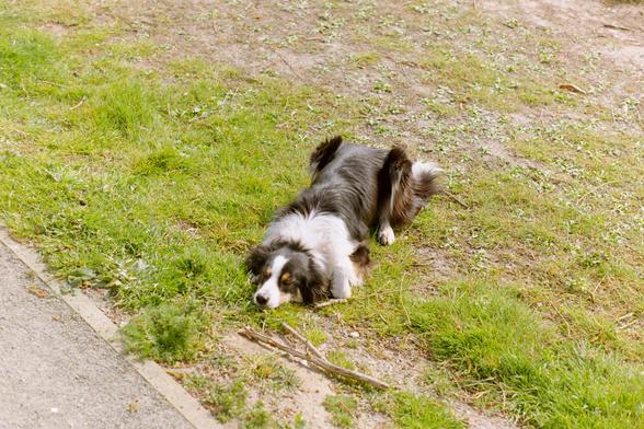
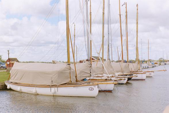
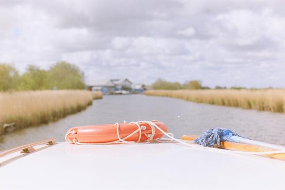
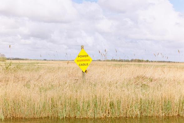
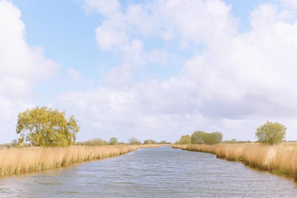
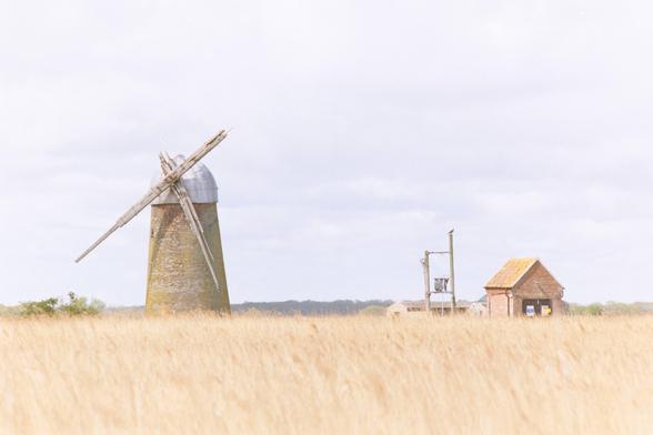
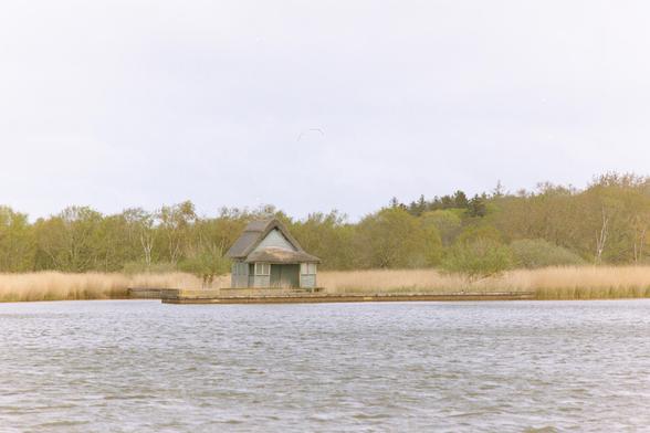
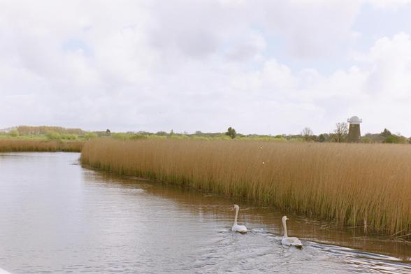
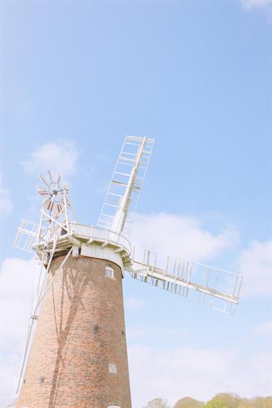
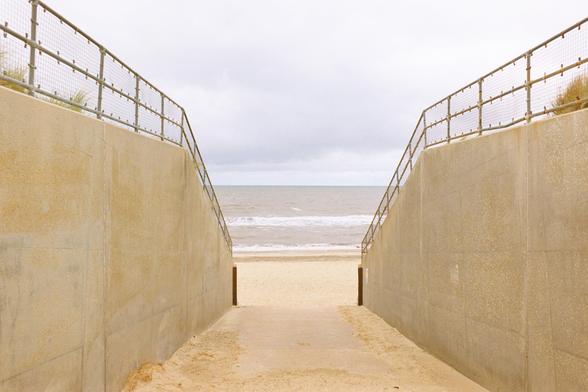
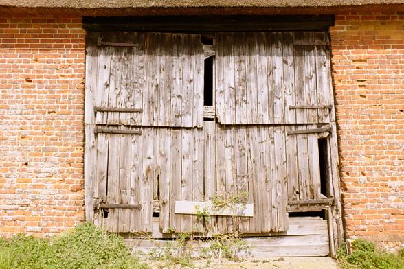
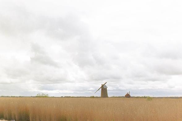
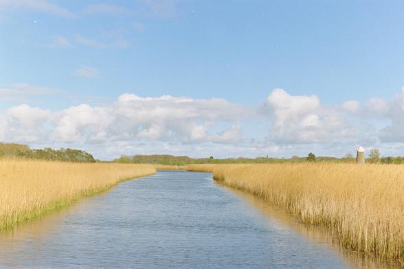
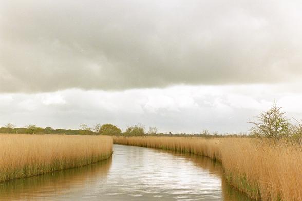
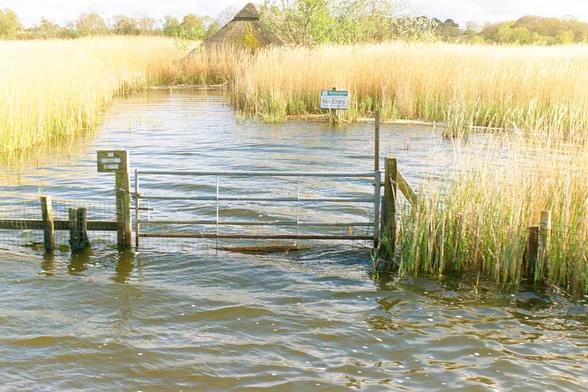
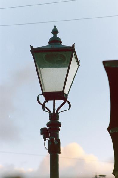
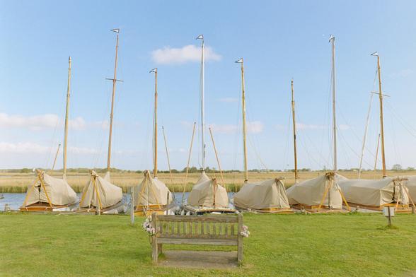
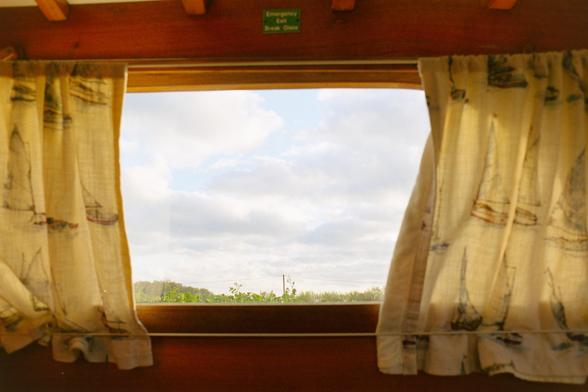
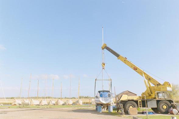
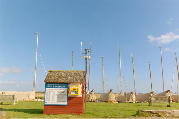
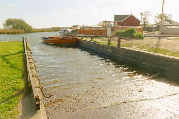
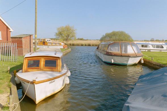
Some photos from our Norfolk Broads visit. These are the 3 rolls of colour i randomly decided to buy from Asda on the way there. I'm glad I did, it turns out that open marsh land does not contain huge tonal range or funky shadows. I'm quite pleased with a lot of them, far more so than I expected. I'll pop a note on a pleasant darktable experience in the next post.

#BelieveInFilm #OlympusOM1n #KodakColorPlus200

All the colour grading on these is *entirely* in #darktable's negadoctor (other than white balancing off my scanning light). Dmax and Dmin set off the leader, used the corrections tab highlight colour off the leader. I then found a good shadow on an actual photo for shadow colour correction. This settings were used on an entire roll. Then I just used the print exposure and contrast gamma. I'm *very* pleased with the results...

#BelieveInFilm #OlympusOM1n #KodakColorPlus200

There are a lot of boat pictures coming, you've been warned!

#BelieveInFilm #OlympusOM1n #KodakColorPlus200

This includes my first proper holiday snap using a 1970s camera self timer

#BelieveInFilm #OlympusOM1n #KodakColorPlus200

On to the Gold. I want to try RA4 printing one from each roll to see hoe close this grading is to what I'd get there.

#BelieveInFilm #OlympusOM1n #KodakGold200

This dog wanted to play. So much so that he decided to put a stick on the boat right by my feet. Genius mive as I literally had to throw it!

#BelieveInFilm #OlympusOM1n #KodakGold200

...and then the UltraMax400

#BelieveInFilm #OlympusOM1n #kodakUltramax400

...and that's all folks! Zero regrets on the colour. It has also reasserted my opinion that most colour negative films are basically the same. I know Gold is beautiful RA4 printed. The one roll of Ektar I've used previously was punchier, and printed exceptionally well, but not 3x the cost better. I'll keep the ektar for half frame, and stick to gold in future.

#BelieveInFilm #OlympusOM1n #KodakUltramax400

@tmcfarlane So Gold vs Ultramax basically a choice on the ISO you need?

(I do love these photos. Something about the very pale colours suits my nearly 70-year-old memory of the Broads down to a T!)

@carusb yeah, plus the extra grain, but that's not very noticeable. The higher key look felt right,lots of very "James Popsys" looks. I up the print exposure and uppedthe contrast about a grade. There's plenty of detail in the highlights on the negs that got crushed/washed out. I do think it looks better than the portra pastel look though.
@tmcfarlane I used to over expose my Portra 400 a bit, made it a bit less pastel. Still got some...