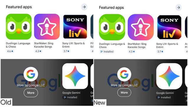
Google has increased the corner radius for app icons on the Play Store
As you probably noticed in the "New" vs. "Old" comparison, this shift makes the icons look significantly more circular and "bubbly" compared to the previous squircle design.
Google has increased the corner radius for app icons on the Play Store
As you probably noticed in the "New" vs. "Old" comparison, this shift makes the icons look significantly more circular and "bubbly" compared to the previous squircle design.