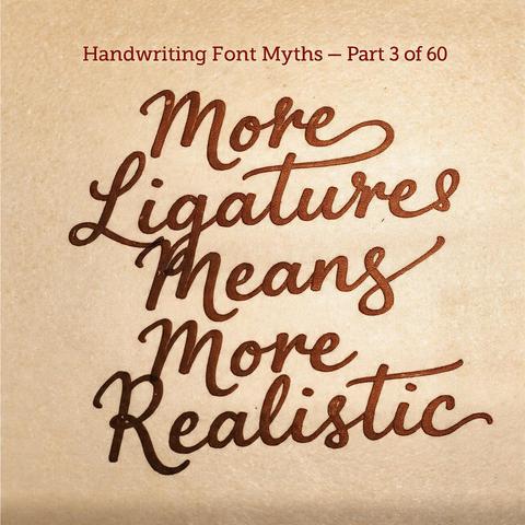
There's a moment when designers first discover OpenType ligatures: turn everything on and watch the font transform. Letters connect. Flourishes appear. It feels like unlocking the font's true potential. The conclusion follows — more ligatures means more realism. But this logic is only occasionally right and often produces the opposite. Ligatures solve a mechanical spacing problem. The deeper visual qualities that make handwriting look human are something else entirely.
Real handwriting never produces the same letterform twice. The second 'e' in 'between' is not identical to the first. That variation is part of what the eye reads as human — repetition of identical forms reads as mechanical, even in beautifully drawn type. Some handwriting fonts address this with glyph alternates: multiple versions of each character rotating as text is set. This feature does more for perceived realism than almost any ligature work. Variation, not connection, is the key signal.