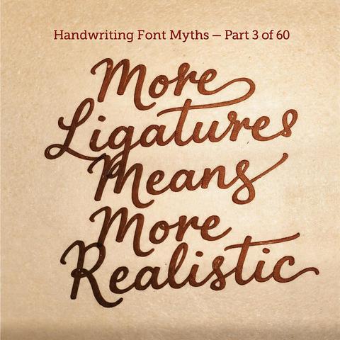
There's a moment when designers first discover OpenType ligatures: turn everything on and watch the font transform. Letters connect. Flourishes appear. It feels like unlocking the font's true potential. The conclusion follows — more ligatures means more realism. But this logic is only occasionally right and often produces the opposite. Ligatures solve a mechanical spacing problem. The deeper visual qualities that make handwriting look human are something else entirely.