Filip Fila and Nuno Pineiro are bringing the classic #Oxygen #theme back to Plasma

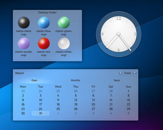
Tastefully colourful icons, shadows, transparencies and shiny buttons are all part of the spectacular reimagined themes Air and Oxygen being painstakingly reconstructed from scratch by the designers.

Filip includes download links in his blog post so you too can trial-run both themes now:

https://filipfila.wordpress.com/2026/04/05/halfway-there-to-6-7-updates-on-oxygen-and-air/

#Plasma6 #desktop #FreeSoftware #OpenSource

@kde Is this a late April 1st fool? Reminds me of the great "success" that KDE 4 was.

😆

@joostruis @kde I had a good time using KDE 4

@kde Good job: keeping old theme alive is a lot of work, but also very important.

Personal story: Linux Mint continues to ship their distro with very old themes. I could, thank to this, maintain this summer the computer of my (old) mother, a Linux-Mint from 2012 that semi-rolled update and upgrade until 2026 but too unstable because of all upgrade layers. I reinstalled a Mint from scratch, and could still put the same color, same directory icons, same start menu and sound, a joy for her.

@davidrevoy @kde also there are some distributions using Plasma that includes all wallpaper releases, I like that!

@davidrevoy @kde This is a massive point I’d say. As much as one can love a redesigned and updated UI, a lot of people who simply rely on computers to make their daily life work in a digital age gets hit very hard by big changes.

A good example of the issue are smart phones. They change so much randomly and constantly that they cause a lot of issues to a large group of people, and I find it irresponsible to be honest.

(Not that things can’t change, but do it with purpose and a plan. Not for a yearly presentation that’s honestly just an ad.)

@kde oh wow, this looks beautiful. Much as I love how clean Breeze is, more choice and fun is a great thing. I look forward to trying this out asap!
@kde awesome, now we just need air

@kde I guess people really do love flashy effects like transparency, animations, etc etc even on their desktop?

Really makes me miss the classic interfaces. I still think the best balance lies further in between the classics from the 90s and 2000s but with modern ideas like dark mode. A UI should be a UI, not "an experience."