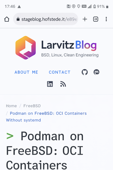
I’m test-driving a new design for my blog and need your feedback!

Old: https://blog.hofstede.it
New: https://stageblog.hofstede.it/e89ee79/

Do you like the new look more than the current one? Feel free to comment with honest opinions or just vote. :)

#WebDev #Blog #FeedbackWelcome #Fediask #webdesign

Love the new design!
46.3%
Prefer the old one
17.1%
They're both good
22%
Other (comment)
14.6%
Poll ended at .
Larvitz Blog

FreeBSD, Linux, all things cleanly engineered

Larvitz Blog
@Larvitz i like them both, the colors on the old is a little easier on my eyes, and i like how you've cleaned up the styling every so slightly on the new.
@Larvitz They're both good, but I like the new one more. Especially the improved contrast and thus better readability.
One thing I personally would reconsider is the combination of blue and green. Blue links turn green. Green elements next to blue icons. Might be just my personal preference though :)

@def Thanks for the feedback. Did another one with smaller titles, less monospace fonts and more consistent link colors ..

https://stageblog.hofstede.it/10da2aa/

Larvitz Blog

FreeBSD, Linux, all things cleanly engineered

Larvitz Blog

@Larvitz
The new one offers better readability thanks to the contrast, looks "techier", but a little more sterile due to the consolish (and just a little too big) title font (the only thing I like more about the old design).

#WebDev #Blog #FeedbackWelcome #Fediask #webdesign

@phetsig Thanks for the feedback. Did another one with smaller titles, less monospace fonts and more consistent link colors ..

https://stageblog.hofstede.it/10da2aa/

Larvitz Blog

FreeBSD, Linux, all things cleanly engineered

Larvitz Blog
@Larvitz the titles on the new one are too big, other than that looks ok

@_hic_haec_hoc Thanks for the feedback. Did another one with smaller titles, less monospace fonts and more consistent link colors ..

https://stageblog.hofstede.it/10da2aa/

Larvitz Blog

FreeBSD, Linux, all things cleanly engineered

Larvitz Blog
@Larvitz prefer the new one, but personally I'm not a fan of dark themes in general.
Both are good, but I prefer the newer one -- I like the darker look of the new one (as opposed to the lighter blue type on darker blue-green background), and the new fonts catch my eye
@Larvitz I prefer the new one, because of better readability for me.
Another thing, some article's first picture overflow its box on mobile, I experienced this with both versions (old, new).
@[email protected] I forgot about the design poll when I visited your site. Both designs are clear. What are the biggest changes you did?

I actually got lost reading your shell tricks. There were a few I didn't know about so thanks for sharing.

https://stageblog.hofstede.it/e89ee79/shell-tricks-that-actually-make-life-easier-and-save-your-sanity/

Very useful. Must not forget to use them. ;)
Shell Tricks That Actually Make Life Easier (And Save Your Sanity)

Watch someone backspace 40 characters instead of pressing CTRL+W, and you’ll understand why this list exists. A collection of shell tricks-grouped by what works everywhere and what’s Bash/Zsh-speci...

Larvitz Blog

@Larvitz

I prefer a light design. ☀️

@Larvitz

there is also someone at work who sets everything to dark mode, terrible really terrible 😐

@Larvitz falls gewünscht, ein kurzer Hinweis: auf mobile fliegt das Bild hier rechts raus: https://stageblog.hofstede.it/e89ee79/keycloak-26-on-podman-with-quadlets-identity-management-the-systemd-way/
Keycloak 26 on Podman with Quadlets: Identity Management the systemd Way

Deploying Keycloak 26 as an identity provider using Podman Quadlets with network segmentation, secret management, and systemd integration.

Larvitz Blog
@Larvitz das neue Design gefällt mir persönlich besser.
@314rate Danke. Um das Bilder-Handling kümmere ich mich gerade. Das macht mich wahnsinnig. Bisher geht es bei unterschiedlichen Versuchen das zu beheben einfach nur auf unterschiedliche Arten kaputt 😂
Keycloak 26 on Podman with Quadlets: Identity Management the systemd Way

Deploying Keycloak 26 as an identity provider using Podman Quadlets with network segmentation, secret management, and systemd integration.

Larvitz Blog

@Larvitz

Da passt der Viewport für mich. Ich finde die neue Seite leserlicher, dank des stärkeren Kontrasts. Macht mich dem ersten Gefühl nach aufmerksamer. Gefällt mir!

Als einziges, was ich mir persönlich bei der Link-Farbe dachte, dass sie ned so gut zum Grün passt. Außerdem erinnert sie mich krass an Standard Links aus jedem Office. Vielleicht wäre die Komplementärfarbe zum Grün ne Idee? Also C046AF wenn mein Colorpicker und das Internet recht haben.

@Larvitz yes, ist behoben 😅

@Larvitz Colours and contrast on the new site work better for me.

Though I would suggest toning down the contrast a little bit for the link colour (it is very searingly blue) and the text colour (make it a little more grey).