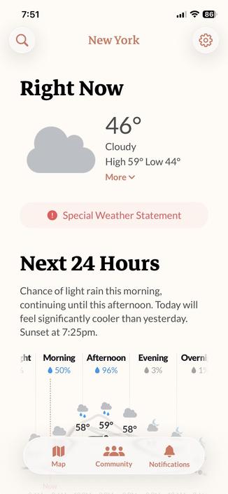
There used to be a weather app called Dark Sky, which had the clearest, most informative UI of any of iOS weather app. The inevitable happened: Apple bought the company, and killed the app.

The people who made it are back with a new app called Acme Weather and once again they've absolutely nailed the UI. It's calm, attractive, and presents the most important data clearly and simply. Why can't more app UIs be like this?

https://acmeweather.com/app

#ux #ui #design

(in another universe, it was the Dark Sky people that Apple acquihired who got the nod to redesign the UI for iOS 26 and instead of Liquid Glass we got something austere and elegant and soothing, instead of jangly glitz)

(and I say this as someone who doesn't even hate Liquid Glass as much as many other people; although I think some of it is objectively flawed, there are definitely elements that work well. It just … could have been so much better).