๐Ÿ˜ #30DayChartChallenge 2026 Edition
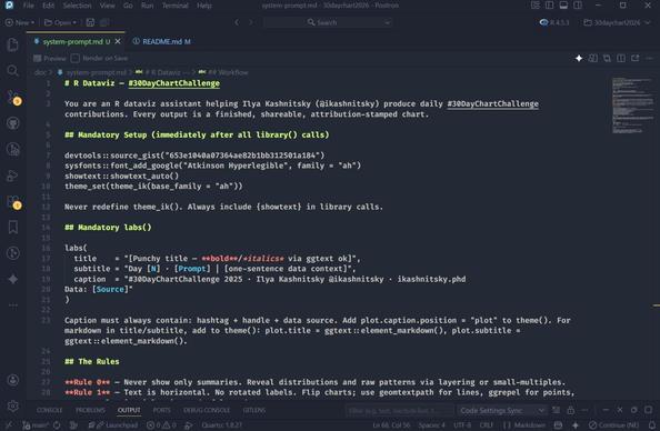
In 2026, coding is not the same. It would be ridiculous to pretend that LLMs are not better than me at coding, or at least faster. So, this year I decided to participate in the challenge with most of the heavy-lifting done by AI helpers. I created a dedicated space in perplexity with the system prompt that you can see in the github repo. And yes, I expect that this setting will allow me participate wihtout an extreme toll on my time.
๐Ÿ”— https://github.com/ikashnitsky/30daychart2026
DAY 1 -- part-to-whole โ˜ข๏ธ #30DayChartChallenge
To jumpstart the use of Claude Sonnet 4.6, I chose to grab one of the most known datasets -- Titanic survival by sex and passenger class
๐Ÿ”— #rstats code: https://github.com/ikashnitsky/30daychart2026
๐Ÿง™โ€โ™‚๏ธ ai chat: https://www.perplexity.ai/search/day-1-part-to-whole-let-s-play-9r2UB4azS3iaj5urON4OXg
DAY 2 -- pictogram #30DayChartChallenge
Drawing my dataviz "rules" (https://github.com/ikashnitsky/dataviz-art-skill). Two versions here: a poster coded in R (ugly) and one generated by nanobanana ๐Ÿคฉ
๐Ÿ”— #rstats code: https://github.com/ikashnitsky/30daychart2026
๐Ÿง™โ€โ™‚๏ธ pplx: https://www.perplexity.ai/search/day-2-pictogram-visualize-my-d-5.dmFgnySe.ZSfIqBHgSng
๐Ÿ’Ž gemini: https://g.co/gemini/share/33e4c78ebbf5
DAY 3 -- mosaic #30DayChartChallenge
I'm visualizing the diversity of African linguistic families ๐ŸŒ
This was a #TidyTuesday dataset in week 3 of 2026.
๐Ÿ”— #rstats code: https://github.com/ikashnitsky/30daychart2026
๐Ÿง™โ€โ™‚๏ธ pplx: https://www.perplexity.ai/search/day-3-mosaic-let-s-use-this-ti-zDS__DsJRq.JzH_jXJ7NVw
DAY 4 -- slope #30DayChartChallenge ๐Ÿš 
This is probably the most important development for humans in the recent history -- the tremendous growth of life expectancy across all countries ๐ŸŒ #demography
๐Ÿ”— #rstats code: https://github.com/ikashnitsky/30daychart2026
๐Ÿง™โ€โ™‚๏ธ pplx chat (refactored): https://github.com/ikashnitsky/30daychart2026
DAY 5 -- experimental #30DayChartChallenge ๐Ÿงช
๐Ÿคฏ mind-blowing! I always wanted to explore d3 but never got there. Now I simply uploaded yesterday's #rstats script -- and Sonnet just did it ๐Ÿคฉ
๐Ÿ”—FULLY INTERACTIVE VERSION: https://ikashnitsky.phd/x/d3/05-experimental.html
๐Ÿง™โ€โ™‚๏ธ pplx chat: https://www.perplexity.ai/search/day-5-experimental-for-today-i-ldYZ2qw3Q3qBmwhhF902CQ
DAY 6 -- Reporters Without Borders #30DayChartChallenge ๐Ÿ—ฝ
Press Freedom is in a steady decline across the world ๐Ÿค
๐Ÿ”— #rstats code: https://github.com/ikashnitsky/30daychart2026
๐Ÿง™โ€โ™‚๏ธ pplx chat: https://www.perplexity.ai/search/day-5-experimental-for-today-i-ldYZ2qw3Q3qBmwhhF902CQ
@ikashnitsky It looks great, but is something off about the axes? The UK has a slope going up, but appears to go from 83ish to 73ish when using the name label on the left and right axes
@jimgar yeah, perhaps this should have been classified โ€” text on the right and left is *not* mapped to Y-axis, countries are only sorted by life expectancy in the decreasing order
Visualizing African linguistic family diversity as a mosaic is a great match โ€” the tile structure maps naturally onto the categorical grouping. The color encoding carries a lot of weight when the tiles are this dense.