First look at Faircamp 2.0 (˶ᵔ ᵕ ᵔ˶)

https://simonrepp.com/video/faircamp/first-look-2-0/

(note that the project is still work in progress and currently at about 50% of completion, i.e. you're looking at a prototype still :))

#faircamp

First look at Faircamp 2.0

A first look at 2.0 from a work-in-progress perspective at about half-time.

/video

I've also just published a blog post - this one's in german though - which outlines some of the #faircamp project planning and progress of the last weeks (this is part of the reporting for my non-profit funding, just for context :)):

https://www.netidee.at/faircamp-20/projektmitte-faircamp-20-zwischenfazit-architekturinterface-entwicklung

And yeah, shout-out for netidee once more, they're making all of this possible with their support! \ʕ◕ᴥ◕\ʔ

Projektmitte Faircamp 2.0 – Zwischenfazit Architektur/Interface-Entwicklung | netidee

netidee
@freebliss looking mighty fine 👀

@freebliss

Looks great, very excited for this!

@freebliss Whoa, this is getting so fancy! Does Faircamp already have a logo?
@rostiger so far it's been this one :)
@rostiger I've always been a bit torn about the (in my perception) friction between the flowing f and the sharp brackets (and to a lesser degree that the logo is a bit imbalanced/restless due to all the triangles and directionality, but thus far I've been ok enough with it to not re-do it '^^
@freebliss Oh, that's quite nice actually! It immediately gives me an idea for something I'd like to try. Would you be available for a proposal? 
@rostiger Sure I don't mind, thanks for offering. Worst case I'm either not convinced or not ready for it yet :)
@freebliss I wouldn't stray far from what you've got now, but adjust the relationships a little. This is just a quick sketch, but it shows the direction I'm thinking. The shadows in the brackets are just a style experiment and could be toned down or removed altogether if they create too much noise. What do you think?
@rostiger Most notably about it I find the Escher-esque loop intriguing (as @damaru also notes). I'm also noticing that I'm intuitively missing the ornamental f (as a visual reference to both sheet music and f-shaped resonance holes in instrument construction), although that is arguably also the thing that makes the whole thing so hard to handle graphically and might need to be reconsidered. Sidenote: I did some logo scribbling on the train a few weeks ago and am noticing that the approach of tilting and using the brackets more as a rectangle(-ish) framing happens to coincide in both our takes. Something else that is also re-emerging from the back of my head: I was previously (probably also across multiple/other projects) thinking whether a/the project needs a single branding or whether it'd be interesting to explore different "visual flavors" of a common theme/visual for identity. (On a practical level that could for instance mean that the SSG allows choosing between different logo flavors for the favicon/on-page logo icon etc.). Then again maybe this is creating complexity and novel problems without a dire need for it. '^^ That'd be my thoughts right now, but I'll let it sink in a bit. Happily let me know if you have thoughts on any of this, and: Thank you for nudging this process a bit!

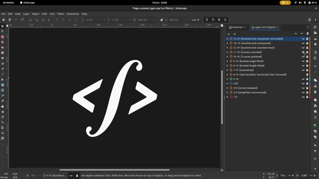
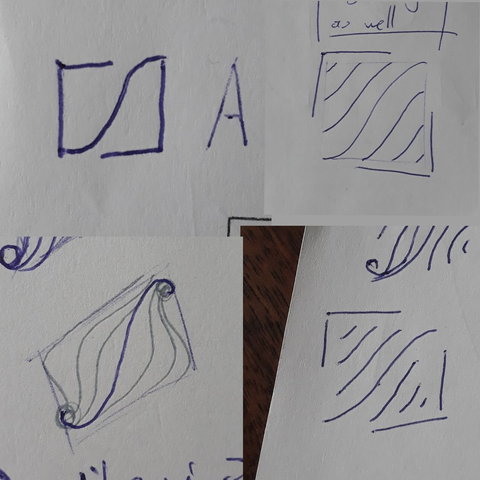
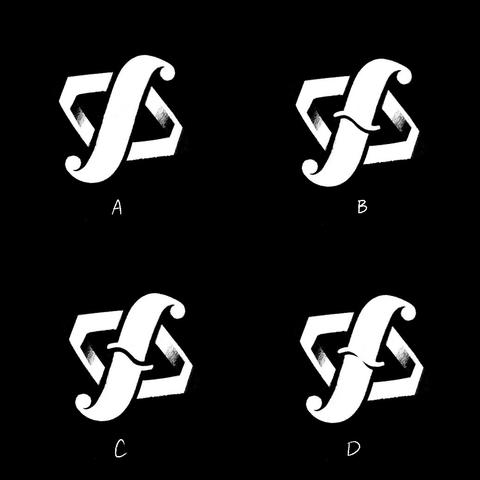
@freebliss @damaru Awesome, thanks for your input. I definitely can see the ornamentality (yes, I just decided this is a word) decreased in my approach, but I think there could be a middle ground. Also the horizontal line of the f bothered me right away, but I have some ideas for that. I might do another sketch sometime!
As for branding I think that's an interesting idea, but probably infinitely harder to come up with one logo that has to encompass all these different types of projects?

Also when you think visual flavors, are you thinking the same basic shape, but with different colors? Or could the stroke style be different as well? Sounds interesting, but also might make your life more difficult when it comes to accessibility (I am thinking e.g. of just color variations that people with visual impairments might not be able to differentiate).

@freebliss @damaru I just had some time and inspiration, so I came up with a few flavors of the original sketch to see if I can bring back some of that ornamentality as well as playing with variations of the horizontal f bar. What do you think?