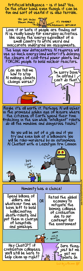
My friend won a hundred bucks at a poster competition for *promoting generative AI adoption* with this poster, by popular vote no less. Hilarious

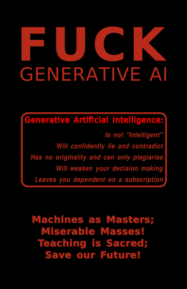
@somebody reminds me of this thing i whipped up a while ago solely to passive-aggressively put up next to an ai generated poster

http://bluepixelcomputing.com:8141/aiposter.pdf

@GroupNebula563

Good list, thanks for that!

@unchartedworlds @GroupNebula563 Don't forget, no matter how obvious things might seem, this bit made rounds and took off because it was stupid, not terribly well considered. The simple truths of it are what has mass appeal. It will be necessary to fight this fight where the lowest common denominator lies first. Don't ever overthink your messaging. Most people are well meaning but never got a chance at the education you got. Something to think about subtly: speak truth to power, not power in truth.

@somebody @GroupNebula563

Yes I did appreciate the simpler one as well! And the hilarity of it having won on popular vote :-)

I'm tentatively brewing a blog post to explain to (relatively educated but non-techie) people, so seeing a variety of overviews is useful.

@somebody @ai6yr thank your friend for my new phone lock screen 👍🏼👍🏼
@somebody
Let's write a prompt to First Dog on the Moon >
@somebody Could be used for a lot of things!  
#uspol
@somebody ah, thanks for this post! A lot of people tend to generalize AI as all of AI. While it can be a helpful tool for our lives. Yup, we hate slop.
@somebody hardly legible for those of us with a red green colour blindness. (10% of adult males)
@peterbrown I have blue-green color blindness and did not detect that. This is red on black. Is the difference in luminosity between the text and the black background that invisible for you? Asking this in earnest.
@peterbrown The version we are putting up on bulletin boards is black on white at any rate, and here there is alt text. But this is the first I've been told by a red-green colorblind person that they had difficulty reading the digital version.
@somebody a dark red on a black surface is quite difficult to pick out. Just not enough contrast.
The top two lines are fine because there’s enough of a block but as the type face gets smaller, it tends to get lost against the dark background. It’s still legible, but not easy.
It certainly doesn’t stand out in the way that I imagine a normal person would see it!
@peterbrown Huh, it was even made lighter to avoid that, it's not easy to look at even for a color sighted person if it's fully saturated. Well, no matter, it can be hue rotated or inverted easily in most any image editing software and the alt text is there for anyone who wants to share it as plain text. Feel free. I was going to make a version that's simple black and white anyway for canvassing like I said. Feel free to manipulate it as you wish in the meantime.