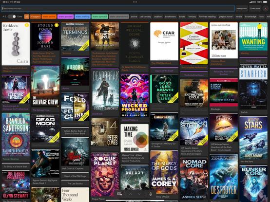
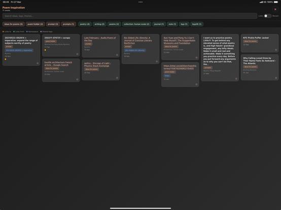
Accidentally fallen into interface design. Been playing a lot with HTML preview actions in #Draftsapp in recent months, starting with things that were just styled lists, and now I've landed on interfaces based on masonry style layouts. Been finding those particularly useful for reviewing collections of items— tasks, projects, knowledge items...

Lists become overwhelming beyond a certain threshold. For me, unless the sequencing is particularly important: long list < masonry board.

@jslr What is a "masonry board" in this context? Internet searches all want to sell me cement- or plasterboard and/or inform me about freemasons.
@gabe Fair question! Search term "masonry layout". Typically: a grid with fixed columns and variable item heights. Perhaps most commonly recognisable as the Pinterest layout?

@jslr I'm not familiar with Pinterest, but I think I will refer to this as a Kankanbanbanban board.

Thank you!

@gabe Love it. :)

Also, if it helps, an image of my books/audiobooks inventory management interface attached. Doesn't really demand as much structure as when managing projects/actionables, so no lanes. Controlled/filtered through tag selection.

This is probably a more typical usage of a masonry layout (wall of images).

@gabe ...and an alternate take— something I've just started to work with: an interface for starting points for writing; collection of text items that I don't need to process sequentially, but instead want to eye-surf and grab whatever calls to me to progress further.

Formatted as a straight list, the collection would likely get weighty as it grows. This layout allows me to dispense with the notion that I need to work through the each item and instead encourages more of a grab-n-go approach...