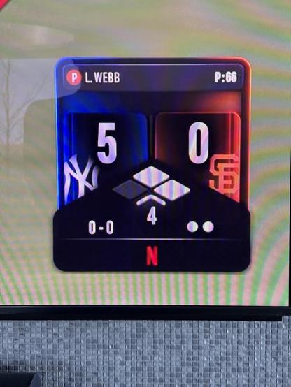
Netflix - you didn’t pass the test.
The outs graphic should have three dots, not two. Because there are three outs to an inning.
Netflix - you didn’t pass the test.
The outs graphic should have three dots, not two. Because there are three outs to an inning.
Why is having two dots wrong? Because there are three outs to an inning. I mean, why have TWO GREY DOTS when there are zero outs? Even after the third out, Netflix doesn't change the graphic - it remains as TWO DOTS.
How Netflix shows how many outs there are:
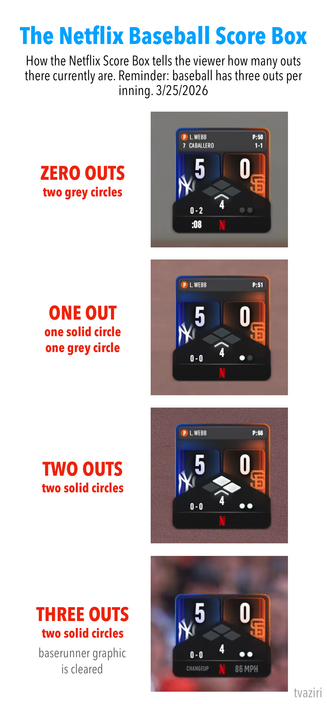
@tvaziri This is a terrible rationale, but I am willing to put a dollar on a designer who doesn’t watch sports deciding it made sense because the third out marks the change of innings, so, not too unlike a clock that changes from 23:59:59 to 00:00:00.
But then with two dots you have all the confusion issues you describe. It’s why you don’t call a ‘cart’ (or ‘basket’) a ‘schlarffledinger’ on an ecommerce site. Just do what people expect.