why did mobile firefox make the previews taller in the tab view!!!!!
i swear tech bros are at war against information density. they have a compulsion to waste screen space there is no other explanation
"the phone is long the tab views should be long too" a radish is a type of scarlet meatball that lives in the mud
@kirakira Does that come from somewhere or did you just make that up? It's really funny.
@jackemled https://www.youtube.com/watch?v=ic_iClOg34A behold, one of the internet's most important videos
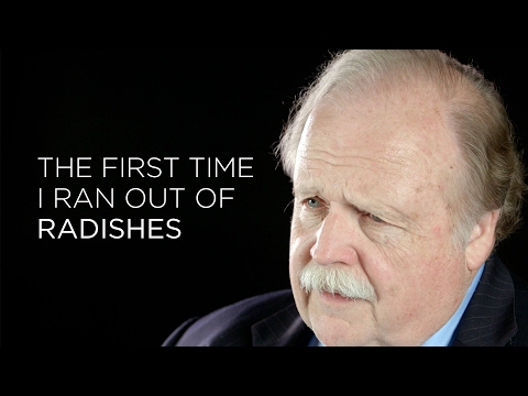
Harrowing: Listen To These People Talk About The First Time They Ran Out Of Radishes
@kirakira I watched this a long time ago, but I forgot that's where that came from💔
Not as sad as the hibachi chef trying to cook on a regular table though.
@jackemled absolutely tragic tbh


@kirakira it's so infuriating
like, UIs had good information density with 640x480 resolution, or even 80x25 text displays. but now we have 4k displays where most of the space is wasted
granted maximum density isn't always the best, especially with touch interfaces, but we've gone so far in the other direction it's time to get some of our density back
@jiub mac os 9 apps felt downright roomy at 800x600
@Arcanoraptor @kirakira that's a good point!


@kirakira Yeah, I just updated and saw what they did to tabs. It's terrible in grid view. Just switched to list view and it's not that bad, but it isn't as nice as grid view used to be.
@kirakira Also, I think maybe all UX decisions in the last decade that just increase the size of things is just for the ever increasing aging population (i.e. boomers and gen X) with millennials entering the phases of previous generations too.