@mayintoronto Accidental accuracy is accidental.
@mayintoronto Oh, man…
@mayintoronto
Well, Ven
Well, Ven
@mayintoronto ooooof
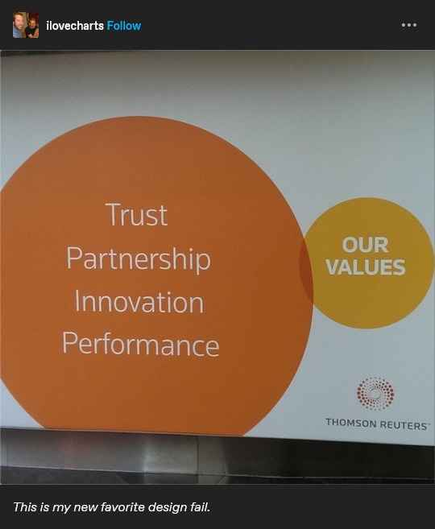
Looks a lot like one of those "business / IT / management" illustrations where three interlocking gears make it impossible for anything to rotate
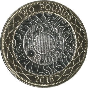
this happened on the British £2 coin until 2015 (the gears were supposed to represent British industry and technology 😁 )
Came here to say this too. Cracks me up every time I see the three interlocking gears of "progress" or what not.
I thought this Venn diagram was "too good" and likely an AI slop production. Pleasantly surprised to find it back as early as 2014 via Tineye, so still could be old school Photoshop, but I want to believe.
@mayintoronto truth in advertising
@mayintoronto I think they call that a Freudian slip.
Truth in advertising
There is some intersection at least!
@mayintoronto accidental design reality more like
@mayintoronto The person who approved this and their boss need to be fired. The employee who did it, if sincerely, needs to learn hard from that mistake.
@trishalynn unconvinced it was a mistake. @mayintoronto
@draNgNon @mayintoronto That is a very fair assessment. If it was on purpose and done in a malicious compliance sort of way, then that person deserves their flowers. If not, then I still assign more blame to the people who approved the design for replication onto the printed ads. :D
@mayintoronto Venn iss anyvon goink to say somesing?
@mayintoronto I’m going to have an aneurysm trying to intuit what they intended to convey with this.
@griotspeak Most of our values are not aligned with what our customers are expecting.