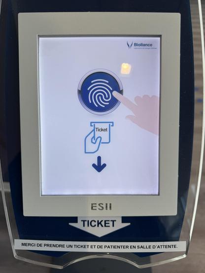
@Stellar @thibaultamartin Yeah, the fingerprint icon makes no damn sense from a UX perspective. I don't have any formal training, but my intuition (as someone who's been absolutely marinating in digital systems for two decades and counting) reads it as "press finger on fingerprint reader" followed by "where is the fingerprint reader?" (This is also why I hate the "under the glass" fingerprint readers on some phone models)
The most obvious improvement is simply remove the fingerprint graphic and have a plain blue button, or add "print ticket" to the button in place of the fingerprint. (I'd keep the finger itself though, I've seen enough "average users" to know it's probably necessary)
EDIT: Though the sticker is probably because "the device doesn't otherwise say what it's there for", so they needed to provide the additional context of "please take a ticket and wait for your number to be called" and couldn't figure out how to change the graphic.