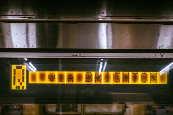
I really like when typesetters go extra on small details, especially in places you wouldn’t expect them.

Here is a little Gorton decoration.

Here are some unexpected small caps on a dying NYC subway train display.
How about an absolutely magnificent shelf-like underline on a landmark plaque.
And of course, the perfect zero line height from a few weeks back: https://mastodon.online/@mwichary/114718547665032407
Marcin Wichary (@[email protected])

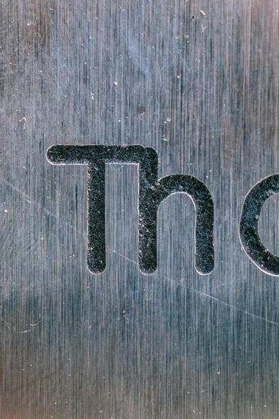
Attached: 1 image This perfect line height overlap (L extending into 7) probably took some effort. 🫡 to the unknown engraver.

Mastodon
I know this is not a real ligature, but it was fun to see today.
I have never before seen Gorton oblique used next to upright text for emphasis. (This is in NYC.)
@mwichary I've seen Gorton engraved signs with some words in bold, but I may be imagining that.
@ExadataDBA I would be curious how that’s done!
@mwichary Not that I'm going down a rabbit hole, but by changing "depth of cut" for a given word result in a different "width of face"? (page 41).
https://archive.org/details/GortonForm1385E/page/n41/mode/2up
Still looking for the example I saw that was clearly Gorton and clearly a "bolded" word.
Gorton Pantograph Instruction Book and Parts Catalog : George Gorton Machine Company : Free Download, Borrow, and Streaming : Internet Archive

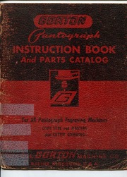
Gorton Form 1385-E. An instruction book and illustrated parts catalog for Gorton pantograph engraving machines such as the model 3-U. The book's date is...

Internet Archive