After spending way too much time crafting typographic favicons for https://jonastype.com, I’m now back at a red circle 🤷♂️
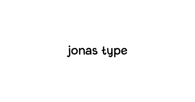
@jonaspelzer as a Polish person, I've read the thumbnail site name as "jonas łype". Because, you know, "t" MUST have the line horizontal. If it's a little lower, and especially if it's diagonal to up-right, it's definitely an "ł" :D
@RetroFunPL This is very valuable insight! Thank you very much! It’s set in my Fictional typeface, and the diagonal-ish lines are part of the overall concept, but I definitely need to reconsider this then for the t. 🙏
@jonaspelzer You could slant it the other way - downward-right :D
But I an also imagine how that could feel... wrong.

@RetroFunPL It really bothered me so I updated it right away 🙃
@jonaspelzer It suits the design IMO 🔴
@tylersticka Thanks! Yeah I thought I’d need a more typographic one but every attempt looked and felt worse than the plain circle 🙃