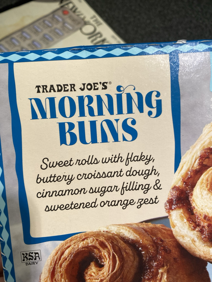
@LikeItOrLumpIt @RobSF Oof, that’s downright disturbing. I would guess that the font came with an alternate cap N and their packaging graphics wizard jumped at the opportunity to get wild. TJs is consistently inconsistent, having no particular style, but also, somehow maintaining a fundamental Trader Joe’s look. They seem to have an extraordinary type library. Their regular newsprint flyer has a vaguely Victorian vibe because of the artwork style they use…
@amiserabilist