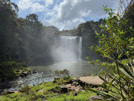
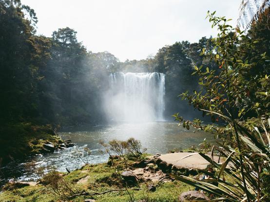
Have been tinkering with #saulala on my laptop since @petrikas made it available as a web app. But today was the first time I tried running it on my iPhone. Amazing! Finally a way to get some decently formed images directly on the phone without Apple's rubbish "make everything a midtone" insanity. If you haven't tried https://app.saulala.com yet, you should. Apple vs Saulala:
@petrikas another comparison. Wild.
@petrikas and another one. Yikes!
@quister @petrikas the phones settings adds a whole lot of localised contrast.

@paulhanrahan @quister I can see 'local contrast' *possibly* working on some sort of segmentation pipeline, but it simply makes no sense in a pixel-based pipeline.

"Clarity", "Highlights", "Local tonemaping" etc. is like sugar to our brains. It feels like an improvement when you push the slider and see things "sharper" or "more clear", but ultimately, adding sugar does not improve the overall taste of something, it just becomes more sugary.

Remember the great "HDR" exposure stacking plague?...

@petrikas @quister agreed on the sugar analogy. The only vague rationalisation on could make for that type of image ( other than “ i want it all!!!) is that its trying to mimic adaption as we look around a scene, but that is a but of a stretch.

@quister I'm very happy you've tried it and made these beautiful pictures! Thank you for sharing them!

Amazing what a human touch can do to a picture; when memory, emotion, feeling and intent is added, it transforms the picture completely.

And I find it's almost impossible to go back to the "random look" generated automatically by the camera.

Thanks again, this means a lot to me!

@petrikas It's a silly thing, but just really pleased to have something in my pocket that can finally render clouds with all of the voluminous beauty that I observe when I look up. The iPhone has always represented them very poorly.
@quister YES! 'HDR' modes often produce what I call 'dirty clouds' which often look uncanny!
@quister @petrikas Not sure if I love the completely blown out clouds, but the green and water feels a lot more pleasing and warm. Would love to see a comparison using Apple Photos' editing tools though. Just a standard output vs a fine-tuned raw file isn't really fair.

@claus @quister The "blown out clouds" is what gives the picture depth. The trees next to the waterfall are clearly a "shadow" area, which would be ridiculous if it would the same energy levels as the sky and the clouds. (And it is ridiculous in the first picture).

You're immediately discarding authorship. If the author's intent was to bring all focus to the waterfall, without losing depth, it only makes sense that "the sky" gets attenuated. It is of non-importance.

@claus @quister there's also "information" outside of the "Field of View" of the camera; the author chose not to include it either.
@petrikas @quister Is it the author’s intention or is it the tool’s restriction? I cognize the sky as bleak and misty, which doesn’t stroke with the rest of the image. I think there’s room for Apple’s local tonemapping but not nearly in the amount they’re doing it.

@claus @quister it is not the tool's restriction, since it's got 'exposure' and "contrast" control.

All 'local tone-mapping' is garbage since it produces broken pictures as shown by countless "HDR" or "phone" pictures that disregard the we read / parse / decompose images.

@claus https://unsplash.com/photos/a-green-plant-in-the-dark-on-a-black-background-8Zj1wywkEhQ

The black background here, for example, isn't created by restriction of the tool either.

And I can bet that there was more information captured than that.

Photo by Atsushi Tsubokura on Unsplash

Download this photo by Atsushi Tsubokura on Unsplash

@claus Notice how your focus shifts from "the sky" to "the cliff".

All this ties well into why the HDR technology as a whole doesn't work.

@claus @petrikas @quister

If we bundle up the ideas into a broader “integration theory”, I think we can see some hints.

For example, try to parse the air material of the waterfall mist. Notice how there can only be one continuum of energy in the totality of the pictorial depiction? If we increase the gradients of the “sky”, we are always implicitly *losing* the depiction of the air material.

I *suspect* this is the ineffable quality of depictions of clouds, too.