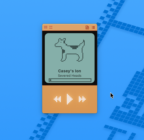
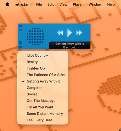
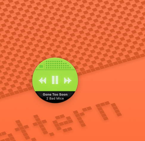
Today: menus, fixing bugs with URL strings, theme tweaks. Actually played a song today!
A larger player window with a different placeholder graphic for album art...
One more theme today... I went through the trouble of sorting out non-square windows and all my themes so far have been square, so here is a round one. Not sure how practical it is, but it's fun. Now I need to switch to left-brain mode and sort out the scrubber.
Learning to avoid being hostile to the new Liquid Glass icon expectations without abandoning my own aesthetic.
@jblake squircle jail tho ;-)
@octothorpe I'll never be content with that decision!
@jblake No matter if you’re being hostile or not, that 45° edge highlight is not going to care 😅
@tuomas_h @jblake that 45° highlight is so tacky. Reminds me of the tacky ass gaudy Trump Oval Office golden decorations. 🤭 but I know that’s not your fault.
@jblake I think that's beautiful. Stylised. Icons nowadays are no longer that - they're all very similar.
@jblake this is gorgeous. I love the style. 🤩 Although it does give me Spotify vibes given both the shape and colors. 😅
@jblake I'm curious, how are the themes structured? Is that HTML/CSS-based, or something else?
@csilverman It's json and png files, in a folder inside the ~/Documents folder. I wanted to make the theme files easily accessible for anyone wanting to tinker.
@jblake Cool. Is the player shape defined there, or by the player graphic itself?
@csilverman At the moment, the player graphic.

@jblake yeah, I think I remember this was sort of how Audion did it, although it's been years since I dismantled one of the Audion themes, so I don't recall the specifics.

This looks great. I look forward to these updates every day.