I fail using this UI at least once a week.
It's the AirPods Control Center volume pane, where I go to put my AirPods Pro into Adaptive mode (which I have configured a hundred times to be part of the long-press selection, but that always gets inexplicably forgotten).
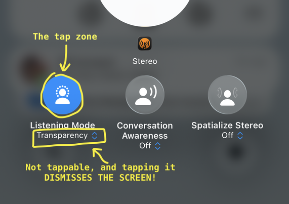
What you're SUPPOSED to do is tap the circle to bring up the modes.
But right below it is the OBVIOUS LOOK OF A DROPDOWN CONTROL, complete with the double-arrow and tint color, but it is NOT ACTUALLY A TAPPABLE CONTROL AARRGGHHH 😡