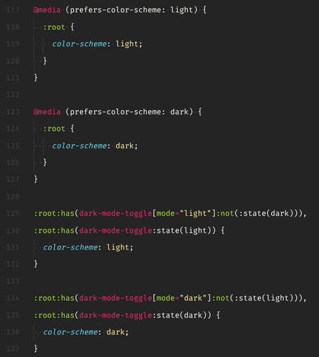
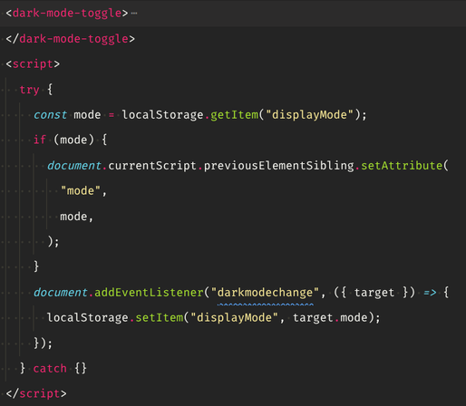
The hoops you jump through to battle FOUC when <dark-mode-toggle> is a #webcomponent with custom dark/light states... but all this async JS magic may need some time to initialize, so there's also a content attribute for the initial state, but that may in turn be overridden by user choice (and therefore one of the custom states) 🥴

#css #webdev

@sir_pepe The first two blocks can be simplified with `:root { color-scheme: light dark; }`, I believe!

As for the flash (a.k.a. FART), if you have the value stored as a cookie or localStorage, you can perhaps use that value as an override to the suggestion above with a script in the `<head>` to the tune of `document.documentElement.style.colorScheme = localStorage.getItem('theme') || 'light dark';` perhaps? (I wrote about something similar: https://chriskirknielsen.com/blog/my-under-engineered-way-to-avoid-a-flash-of-inaccurate-color-theme/)

My under-engineered way to avoid a Flash of inAccurate coloR Theme (FART) | chriskirknielsen

It all boils down to a single line of JS.

chriskirknielsen

@chriskirknielsen Oh neat, "color-scheme: light dark" works indeed! Thanks!

I just write the state from storage into the toggle element to centralize the mess at least a little 🙃

@sir_pepe Yeah it's a mess to have these overrides, which is why there are some proposals to build them into the browser on a per-site basis, but for now, the messy solution is the way to go.

Interesting use of `currentScript` BTW!

@sir_pepe Lots of discussion around this in https://github.com/GoogleChromeLabs/dark-mode-toggle#usage (Not sure if you saw this, your custom element seems to be named the same as the one from the repo.)

@tomayac First time I realize that Chrome has its own <dark-mode-toggle> 🙃

Looks like the vibe is very different from my thing, which wants to be the single source of truth first and an interactive widget second: https://www.npmjs.com/package/@sirpepe/dark-mode-toggle

All I REALLY want is to go ":root:has(dark-mode-toggle:state(light)) { /* changes */ }" and stop thinking about dark mode.

@sirpepe/dark-mode-toggle

A web component for switching between light and dark modes. Latest version: 0.1.3, last published: 3 months ago. Start using @sirpepe/dark-mode-toggle in your project by running `npm i @sirpepe/dark-mode-toggle`. There are no other projects in the npm registry using @sirpepe/dark-mode-toggle.

npm
@sir_pepe The objective of ours was mostly making the fighting against the browser (i.e., the theme override) be as performance-neutral as possible. Also to flexibly be switch and toggle at once.