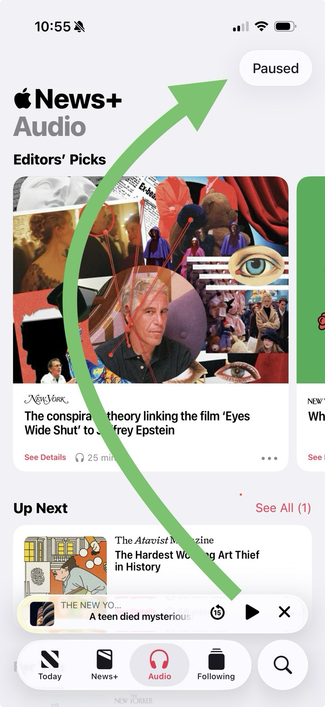
I guess someone at Apple must enjoy looking at toolbars like this from time to time. I don’t.
@noheger The beauty of this whole interface redesign is that in 5 years it will get a big refactoring to suck less and Apple will hail it as a huge advance and a major reason to upgrade…
@slyborg @noheger Yeah - Apple just said "bye" to that Dye guy so it will take a while to recover.

@dxzdb @slyborg @noheger

Assuming he was the critical driving factor.

@jonhendry @slyborg @noheger True - given his reputation I'm sure it didn't help. I remember some of the Apple folks on the WWDC panel reacting to incredulous Dev's seeming sort of frustrated and saying: Submit feedback...

@slyborg @noheger

"it will get a big refactoring to suck less"

That's what we hope for (but sooner). Yet at this point, based on recent performance, it's entirely possible it could get worse.

@slyborg @noheger it won't get a huge redesign. Just like iOS 7 (which was also damn near unusable), there will be small iterations every year to improve it.

Remember - iOS 18, the thing people want to go back to - is a direct descendant of iOS 7, but with a decade of improvements. Liquid Glass will get there, also.

@slyborg @noheger … or it could get worse.
@noheger It will not be a shame if Apple assume Liquid Glass was a mistake and roll the UI components back to High Sierra era.
@rogelin @noheger We need to go way earlier than this
@noheger @gruber It looks dramatically better in dark mode. It’s like the forgot about light mode
@tweece @gruber Well, I wouldn’t call this dramatically better…

@noheger

We just need all the people at Apple who were responsible for this crock of shit on macOS to form an orderly line.

@noheger God I hate this translucent-everything borders-on-nothing shit. I hated it in Mac OS X 10.0 and I hate it now. Last year’s UI with translucency cranked down was pretty close to a good evolution of the System 7 interface and should have just kept going along those lines but the graphic designers who think they’re HI professionals at Apple always get their way.
@noheger They’re the type who respond to bug reports—when they deign to read them at all, “that’s not how we work”—containing detailed feedback by other professionals with “This design was approved at the highest levels. Please close.” Instead of, you know, actually taking the feedback seriously and bringing it to the executives who approved the prior iteration in their next meeting.
@noheger why is there a Paused blob at the top of my screen? 😩 I thought we were moving controls to the bottom of screens? So many little ‘just works’ things in iOS aren’t bothered with anymore. Sad.
@lukehand @noheger Controls are still at the bottom. Tap ▶️ to Play. When it's playing, tap ⏸️ to pause. The blob at the top is not a control, it's just a status.
@marcintosh tapping the blob also plays/pauses. Like we need another control on screen. This is part of what’s annoying about the state of iOS at the moment - there’s a lot of ‘oh well just add x on this screen to help this particular situation on this particular screen’. Breaks consistency and predictably. 🤷‍♂️
@noheger for decades, we’ve been telling people that transparent Minority Report UIs only work in movies because they’re post-production and camera visibility is paramount, and here comes no less than Apple to prove us right.
@noheger the floaty trend needs to stop
@noheger What a mess. Glad I chose not to “upgrade” to the latest version.
@noheger @gruber Aside from looking bad, it’s not even consistent: the middle column is blurred when behind the toolbar, but the right column isn’t. And the left column is blurred even when it’s not directly behind the sidebar, which is both illogical and also inconsistent with other apps. It literally looks like a work in progress that they just went ahead and shipped anyway. Really sloppy!
@noheger at first, I thought it was a rendering error.
@noheger I have an old Mac mini I use for some tasks, and it’s still on 10.10, Yosemite. It’s such a breath of fresh air to see Finder in 10.10. So clean (the screenshot is not my Mac, but it is 10.10)
@joelion @noheger holy shit, that looks great. Bit dated, but come on Apple: do a modern take on this. Tahoe is unacceptable
@noheger Don't even get me started on the ever-thinning scroll bars 😭
@noheger this is so incredibly ugly.
@noheger doesn't show like this on macOS 26.1 with Dark Mode, not sure if its the version or the dark mode setting though
@liaizon @noheger Is that with reduced transparency?

@liaizon

Here's my window in 26.2:

@noheger This makes it look like they've joined the EssilorLuxottica global eyeglass cartel.