if iso 7010 had a therian warning sign would it look like this or like this
here are the SVG files btw

the hazard signs are from
this Wikipedia page and they're all public domain

the theta-delta was taken from a
page on the Therianthropy Wiki and is licensed CC-BY-SA 2.5, so by extension that's also the license of those SVGs

do not look too closely at how they're made, they're horrible
@mica can i send you a svg of the therian logo that is properly centered and rotationally accurate? seeing things made from the existing therian emblem svg that gets passed around makes me cry
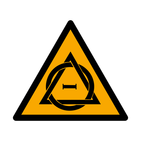
@mica ISO 7010, Therian label. To be used for any working areas that may experience Therian traffic. Label should be placed in a visible location as to inform of the potential for Therian traffic or the possible occurrence of a therian shift in the area.
@mica Second looks cooler, but the first would probably be preferable due to not requiring new and unique sign shapes.
@mica im imagining these are subsequent frames of the sign exploding
@mica therian warning signs are prohibited
@mica definitely the first
@mica second one you could put other stuff in

like put the radioactive sign in the second one instead of the line and bam therianizing radiation symbol
@xeno @mica
Ooh, biohazard rings for therianizing virus?
@silvermoon82 @xeno therianizing radiation and therianizing biohazard
@mica @silvermoon82 @xeno mfw the radiation gives me a tail
@silvermoon82 @xeno @mica therianizing chemicals and it's the corrosive chemical symbol in the center.
Therian Biohazard warning sign... Yes please~
therianizing radiation/biohazard symbol implies therianizing recycle and therianizing no-smoking symbol
@mica it would not because therian is beautiful and does not need to be warned against. is there an iso 7010 compliant way to make a sign that says "go here for good things to happen to you"?
@mica @shitpostalotl closest would be a blue circle (β€œmust do”)
@root @shitpostalotl been meaning to do that when I get to the inkscape machine :3
@mica second one looks better imo
@mica the first one. the second doesnt look like a warning sign imo
@mica the first one would be ISO compliant.
The second one though would be more apt.... And amazing!
@mica the 2nd one looks so hard
@mica second one would be more obnoxious to construct as a standalone plate warning sign, and definitely bends the standard
@mica The first one makes me think "Therian for Therian romance" for some reason. I think it's the double triangles.
@mica The first one because shape and color of ISO 7010 signs are exactly defined in ISO 3864. ​​
@mica WARNING: Therianizing Radiation Ahead.
@mica second one is not compliant (wrong shape) and both of them use the wrong color (orange used is hex F9A800, should be hex F9A900)
not sure if the first one is compliant either in terms of surface area, since at least 50% of the sign has to be yellow
(see:
ISO 3864-1:2011 6.4)

so, neither of these would be viable ISO 7010 signs
​​
@root idk, it appears that the colors aren't fixed but need to fall within a defined range. so maybe they're valid?

https://archive.org/download/iso-standards-collection/ISO%203864-4-2011%20Graphical%20symbols%20%E2%80%94%20Safety%20colours%20and.pdf

See annex E which provides examples of valid colors
@mica minor change i made, i know it kinda breaks the triangle rule but i think it looks better visually like this

-carrie
@mica There are so many more reasons people should warn you about me than just my therianthropy.
@mica Would probably look like the left one, if it was a real sign.
@mica How about GHS :3
@mica left one is realistic. right one is awesome.