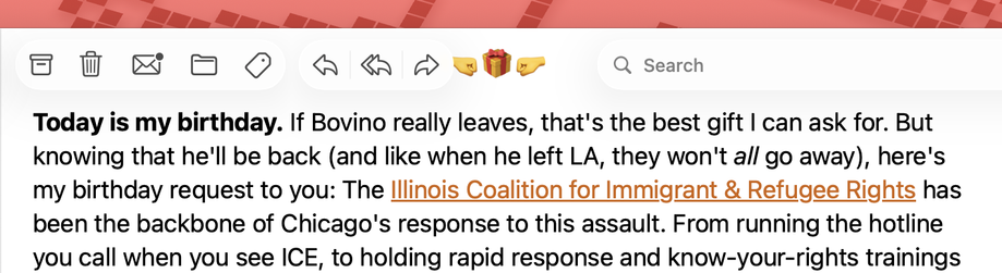
If you need an example of why Apple's new "UI floats over content now" approach is bad, I was wondering what the heck this new fist bump button was in the toolbar of my mail client...
Of course it's not a button, it's emoji in the email I'm reading, but when it lines up it's totally confusing for half a second, which is at least half a second too long for people to be confused by your UI.
(BTW, it's @dansinker's newsletter and it's his birthday, so go give him a fist bump ☺️)