New fonts: Die Grotesk.
—
https://klim.co.nz/fonts/die-grotesk/
—
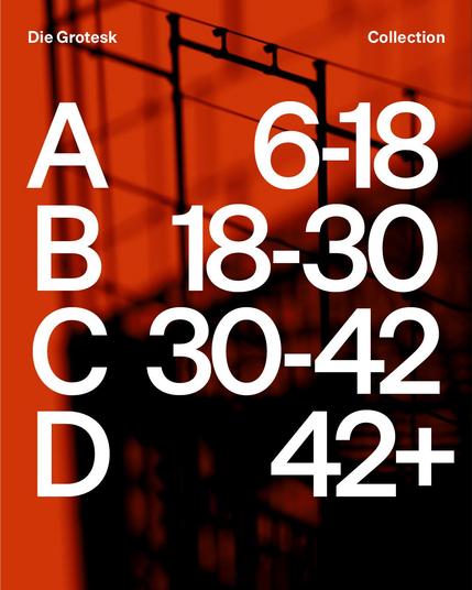
Die Grotesk was shaped in the long shadow of Helvetica, a typeface both revered and resented in equal measure. Graphic designers love it. Type designers hate it. Endlessly revived and resold, simultaneously banal and sublime, its forms feel inevitable. A typeface so familiar it feels like air.
—
https://klim.co.nz/fonts/die-grotesk/
—
Die Grotesk was shaped in the long shadow of Helvetica, a typeface both revered and resented in equal measure. Graphic designers love it. Type designers hate it. Endlessly revived and resold, simultaneously banal and sublime, its forms feel inevitable. A typeface so familiar it feels like air.