@Iconfactory I’m on iOS 18.6.2, in dark mode with light icons. For both Tot and Tapestry, the appearance of icons is inconsistent between the home screen, the selector in the app, and on the “You have changed the icon” message that results when selecting one. E.g. in Tot the automatically adapting icons correctly show light versions on the home screen but are dark in the app and message; and the classic light Dot icon is dark in the message and light elsewhere. Is this an app bug or an iOS bug?
@whereami Tot’s classic icons are not adaptive. Only the new versions are. They will not change properly when you adjust themes. There’s a note right in the settings specifiying this. Hope this helps.
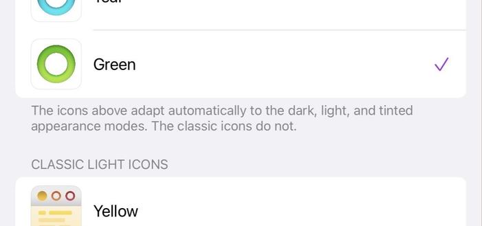
@Iconfactory I understand that. I’m asking why this classic light icon is dark when it should be light. The text you referenced says it does not “adapt automatically”, so it should always be light, right?
@Iconfactory and why all of the adaptive icons are dark in the app and message when I have icons set to light, not dark:
@whereami tap and hold on the iOS home screen, and then tap edit in the upper left to get to the home screen customizations. Do you have dark set there or automatic?
@whereami Please show me this setting on your device. Should be set to automatic.
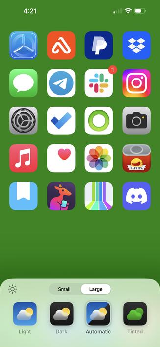
@Iconfactory It’s set to light. Here’s a full demo.
@whereami I know Apple makes this confusing but everything is working correctly here. There are two controls to themes: The overal iOS theme which you have set to dark. And the Homescreen icon customization which you have set to light.
The theme setting is displaying apps (like Tot in the vid) in dark mode. When you switch to the home screen both Tot and Tapestry’s dark icons are overridden by light. Yes, that’s the “light” version of Tapestry’s icon there.
@Iconfactory I understand that too. What I’m asking is why the Dot and Baton Rouge icons, which correctly appear light on the home screen and in the app, are incorrectly shown as dark in the confirmation dialogue; and why the adaptive icons in Tot are incorrectly shown as dark within the app and in the confirmation dialogue.
@Iconfactory Surely icons shown in apps should respect the icon appearance setting, not always be shown in dark mode even if you have icons set to light (I understand that Apple potentially hasn’t made this possible, which is why I asked in my original message whether it’s an app bug or an iOS bug); and the confirmation dialog showing the icon you’ve just changed should surely show you what the icon actually looks like now?
@Iconfactory the Dot case is particularly confusing because it can never actually be dark on the home screen regardless of what settings I select, so why does the dark version of it shown in the confirmation dialogue even exist at all?