The PNAS paper from Monday got a lot of attention

https://doi.org/10.1073/pnas.2420092122

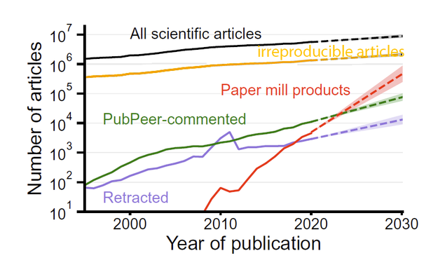
One particularly attention-grabbing point was the growth of paper mill papers, i.e., the red line.
The area under the black curve is the entire scholarly literature. Judging from reproducibility projects, I have added the # of articles that are likely to be irreproducible (yellow).
Sure, paper mills can some day be a problem. But compared to irreproducibility, it's a really minor problem:

https://bjoern.brembs.net/2024/02/how-reliable-is-the-scholarly-literature/

P.S.:
Yes, the Y-axis should be labelled "per year"

I wonder what makes the red curve so interesting and attention-grabbing for people that they completely forget the yellow curve? Is an AI generated unreliable paper somehow worse than a human-generated unreliable paper?

Maybe the paper mills are getting so much attention in the legacy journals because they are a convenient distraction from the fact the yellow curve shows: the by a huge margin largest fraction of unreliable literature is published in traditonal journals - the ones that now heap so much attention on the paper mills.

The corporate publishers also get a twofer: it's convenient to lump the newer publishers (often misleadingly called "predatory") in there - the legacy publishers' "competition".

@brembs
1. Escalating paper mills mean escalating irreproducible research. Technology progress (AI etc.) causes a flood of papers the legacy publishers won't sell, what a pity.
2. We have seen examples in the past that that legacy publishers are affected from these broker networks, too. So studies like this one in PNAS trigger the blame game.