just one more menu item bro. i promise bro just one more menu item and we’ll have a complete product bro. please just one more. bro cmon just give me another. bro bro please we just need to add one mor
@samhenrigold windows 10 file explorer-maxing
@samhenrigold and. and. what if we put it in a hambubger so they could scroll it, and we made the whitespace between items even bigger so they had to
@samhenrigold the icing on the cake for me is that the word was already spelled correctly
@samhenrigold surely this post is sati- oh god.
@[email protected]
Cut, copy and paste on three separate lines look particularly stupid in this day and age IMO
Even Microsoft seems to have realised they can use just icons for these three and put them on the same line.
@m0xEE @samhenrigold I cannot stand this. AND they made them tiny icons too that all look identical.

@m0xEE @samhenrigold

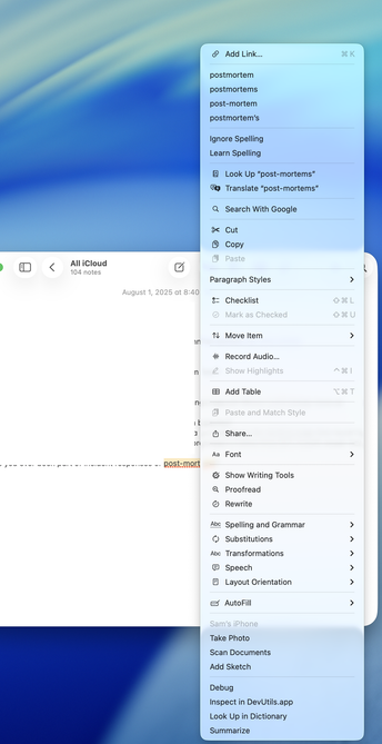
well, never do the anti-pattern Google does on Android where they have three tiny touch buttons for "Cut Copy Paste" jammed adjacent within millimeters of the others, with the harmless one sandwhiched between two destructive ones on either side. They not be hirin smart peeps there in long long time. (Don't get me started on the UI/UX clusterfuck that is Gemini, loltears.)

@samhenrigold @gothpanda I love more context menu options than less but this is fuckin ridiculous.
@colinstu @gothpanda hey hey woah this is a family account, potty mouth
@samhenrigold If the selected word has more than four spelling suggestions, it cracks your screen.
@samhenrigold meanwhile vim users be like "What's a menu?"