It's iOS 26 beta 4 time

legibility is so back πŸ™ƒ

(the last screenshot is the Photos editing UI when trying to crop a screenshot. LOL.)

"Library"
"Today"
@viticci I think they should take a look at this super helpful video someone posted about this https://youtu.be/6yzERQUibNA
WWDC21: SwiftUI Accessibility: Beyond the basics | Apple

YouTube
@viticci At first scroll, I see dark blue. Scrolling further, dark mode kicks in and the icon (but not text) becomes a lighter, more visible blue.
@viticci that has always been terrible (that blue in general). Trying to figure out if they have however managed to make it even worse in b4 πŸ˜‚
@viticci How I feel looking at this:
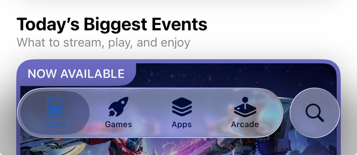
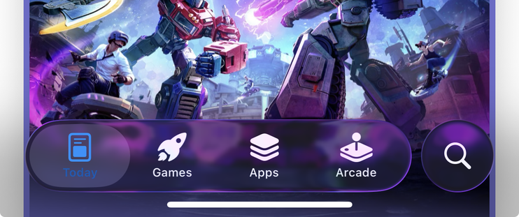
@viticci I believe tinting, as it was initially conceived with iOS 7, doesn’t make sense anymore with liquid glass. The user can perceive interactivity and selection through the glass effect. Adding a custom color on a translucent background will never work.