
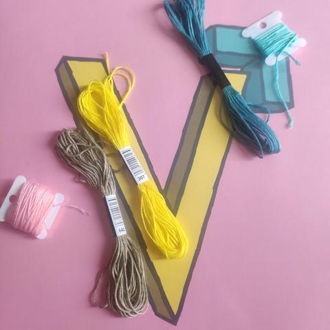
Hey #CrossStitch , #embroidery and other #FiberArts friends, I need feedback on a colour palette!
Would this work?
Hey #CrossStitch , #embroidery and other #FiberArts friends, I need feedback on a colour palette!
Would this work?
@EchteNachtraaf a neat trick I learned from Stephanie Pearl-McPhee is turning the pic into monochrome. If they look the same in greyscale, two colours will blend into each other when they’re directly together. You won’t easily see crisp lines between areas, etc. Your palette has 3x light and 2x medium. If you want a specific pattern to show, the design should always have a medium between the lights.
It’s not WRONG to put the lights next to each other! But the patterning would be very subtle.