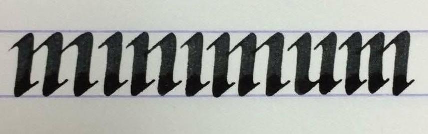
What does it say in the image?

It says 'minimum'.

Hard to read? Medieval scribes thought so too.

That's why they invented the dot on the i.

This way, you could at least see which strokes represented vowels - and that helped a lot.

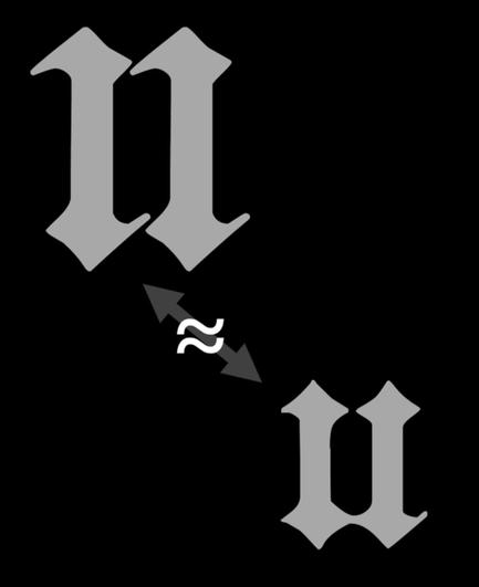
For similar reasons, the letter j was invented.

Two ... 2/

2/ ... consecutive dotless ı's looked a lot like the letter u. A Middle Dutch word such as 'dııc' could be mistaken for 'duc'.

That's why the second ı was lengthened to ȷ: 'dıȷc'.

It originally represented the long ee sound as in English 'freeze': [iː].

However, in the 14th century, ... 2/

3/ ... it started to become a diphthong in certain regions, initially close to what you hear in Cockney 'me': [ɪj].

Later, it became similar to English ay in 'may'.

In certain regions in The Netherlands and Flanders, it eventually became the diphthong heard in 'my'.

Nowadays, ij is ... 3/

4/ ... considered a digraph.

Some even insist it's one single letter (and they can be very vocal about it).

At any rate, ij is always capitalised as a whole: 'ijs' becomes 'IJs' if it's the first word of a sentence.

On signs like the one below, both letters are often put in the same box.

@yvanspijk sluteru 🤔
@beka_valentine @yvanspijk Sluterij, probably another word for sloppiness or a special kind of etablissement. 😜