I repeat—anyone who has tried to make translucent UI is familiar with the story being played out right now. The core issue is that translucent UI is fundamentally flawed. You cannot make it too translucent without sacrifice. But every sacrifice you make makes it less cool. That’s why they started where they did. That’s why they are where they are now. It’s embarrassing to re-tread known issues like this. This could have been an exercise internally that no one ever saw.
https://pdx.social/@louie/114793581017754299
Louie Mantia, Jr. (@louie@pdx.social)

For anyone who’s ever tried to make translucent UI, it’s obvious that to make this “work,” you have only a few options. You can make the controls more opaque, but then you lose the desired impact of the glass being clear. You can blur the content, but that’s at the expense of the content being clear. You can dim the content, but it compromises on both the content and the glass effect. This is consistently the problem with translucent UI. And everyone knows that. https://pdx.social/@louie/114760076589198466
pdx.social
The thing that kills me is that this is not Alan Dye’s first rodeo. That was iOS 7. His first go at doing software design was fixated on this same thing: translucency. It’s as if he can’t let it go, forcing everyone else to tag along while he makes discoveries the rest of us have known for quite some time. It’s awful being the end user of a product designed by someone who is effectively saying, “Oh, it’s illegible? Interesting. I didn’t know that.”

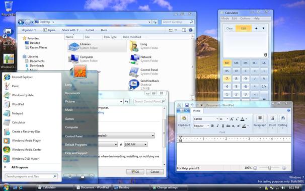
@louie I think Microsoft kind of nailed it with Aero almost 15-20 years ago (especially when in matured with Windows 7) 🤔

I don't remember any legibility issues back then - but because they used this glass material only as a "chrome" - window borders, backgrounds - on top of this „glass” we had placed "normal" opaque controls.

Of course it never reached its full potential - there was not many apps to even try to use it - but that's Microsoft curse for decades.

@kkolakowski @louie OK but that start menu is about as illegible as a lot of liquid glass that is getting (rightly) criticized

@maxoakland @louie Does it? 🤔 It has darker tint, with white letters, I think perfectly legible. Blur and transparency is doing their job.

BTW: I don't have issues with Liquid Glass but I imagine some people might have

@kkolakowski @louie I have a big problem with Liquid Glass because it's either illegible or boring, but I think it's worth criticizing that start menu. It's not legible enough. They have a glow around the text in window Title bars that improves readability (although it does look ugly) so they probably should have put it there as well
@kkolakowski @louie And Microsoft still dialed back from Aero's translucency because being *that* see-through was a bit of a parlor trick, tbh. I think they really got it right (after Metro's over-correction) with Fluent's acrylic/mica surfaces. They let enough color through to visualize the z-axis of the window space without the detailed visual clutter of Aero or Liquid Glass. It's like impressionism vs realism. (And like Aero, it's been cursed with a lack of adoption.)

@louie my thoughts exactly.

I've had an idea in my head for a 'frozen liquid' UI design language for a while. Things look like liquid when animating in, but then it 'freezes' into crystallised ice, with a subtle texture and edge glow but barely any transparency, once it's in place and being used. I'm not confident it'd be effective but I'd love to find out!

@louie @frankrausch All true. But then there wouldn’t have been a fancy presentation moving ridiculous physical glass blocks around on paper, marveling at the refractions. It feels like the reveal was very much driven by marketing, intentionally emphasizing the glass effect for the story and controversy, while they already knew it would never ship like that. Everyone’s talking about Liquid Glass now, as if it’s a new paradigm, while the reality in beta 3 seems to be more incremental.
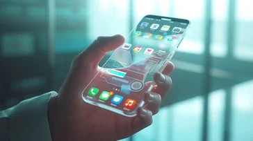
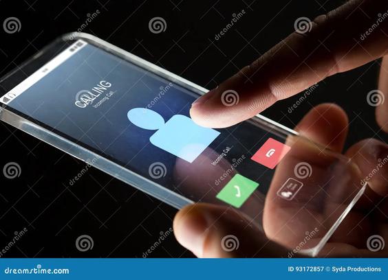
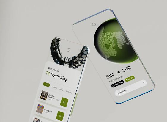
@louie @harryfk Glass devices are such a sci-fi stock photo/dribbble trope, but even they do better by usually having interactive elements be opaque. It’s been well thought out, not least by Hollywood, you’d think they wouldn’t have to work it out in public like this.