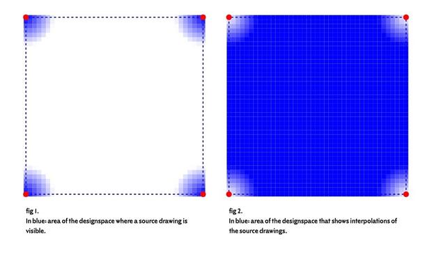
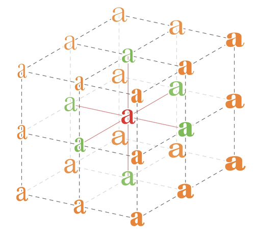
Sunday morning designspace-thinking. While it is worthwhile to make each variable font source perfect, the majority of your designspace consists of mixes of these sources. How far does your perfect reach? When and how were you going to look at the actual outcomes? Oh of course, Longboard for @RoboFont , right from the start https://github.com/LettError/longboardRoboFontExtension Illustration with @drawBot
@letterror @RoboFont @drawBot additionally you can have one or more @fontra windows open at arbitrary designspace locations. It will respond to changes in RoboFont (on save).
@letterror @RoboFont @drawBot In my mind, it’s all the same design so it’s all perfect. “Draw the sources, proof the instances”
@klim @RoboFont @drawBot This was a question about getting there.
@letterror @RoboFont @drawBot I don’t understand the question 😂
@klim @RoboFont @drawBot Sources and interpolations end up being perfect. But it doesn’t start that way, it takes effort and relentless proofing. You know all this!
@letterror @klim @RoboFont @drawBot so curious about the word "perfect". Is it possible for interpolations and sources to be perfect, in the end?
@nicoledotin @klim @RoboFont @drawBot Probably not, but the effort to get both interpolations and sources to some level is the same. My diagram was about proofing and an argument for balanced visualizations.
@nicoledotin @letterror @RoboFont @drawBot In the end? Yes, you’d hope so. Otherwise it’s not finished?
@klim @letterror @RoboFont @drawBot design is a series of choices, which I would argue is a specific path, but perfect ... perfect is universal? And not possible? But aside from that, if we think of perfection as without flaw, our current spacing and kerning technology alone doesn't allow for perfect whitespace, for instance. #existentialtypequestions
@nicoledotin @klim @RoboFont @drawBot I fully regret using that word.
@letterror lol mission accomplished

@nicoledotin @letterror @RoboFont @drawBot Well, my perfect isn’t your perfect, isn’t their perfect…

Sometimes perfect is outline fidelity, feeling, a kerning pair, a curve. Sometimes it’s just being finished. Dictionary / metaphysics perfect is a concept, so nothing will be it. We’re going for designer or typographic perfect, which is achievable, I think, with fonts.

@klim if perfect is relative, is it perfect? ha ha we could do this all day. sometimes debating is perfect.
@nicoledotin I’d be down for that!

@letterror @RoboFont @drawBot “Relentless Proofing” is beautiful and exhausting. I might use it for marketing!

“Meticulously drawn. Relentlessly proofed. Klim Serif.”

@letterror @klim @RoboFont @drawBot The biggest issue I find in variable font development—beyond more than one axis—is that one can’t know at the outset how many masters one is going to need, and how much work is going to be involved in making corner locations correct* until one has completed and tested the axis extrema masters.

This obviously has implications for pricing variable font making.

*Where ‘correct’ is a locally and technologically restricted ersatz for perfection.

@TiroTypeworks @letterror @RoboFont @drawBot That’s always been a problem since MM-based development, right? Like when you think you’re finished and realise you need a lighter / bolder / narrower style…
@klim @TiroTypeworks @letterror @RoboFont @drawBot Absolutely. It has been a problem forever (well, going back to 1990s, at least).
@klim @letterror @RoboFont @drawBot Except MM technology *required* a master at every extreme location, so interaction between axes was always explitictly controlled by corner masters. OT variations technology does not require corner masters, but it is difficult to anticipate whether a particular design will need them at some corners, whether those masters will need to be complete or only for specific glyphs, whether you might only need metrics variations....

@klim @letterror @RoboFont @drawBot MM development always involved a predictable number of master designs derived from the number of axes.

I made this 2016 illustration of a three-axis variable design space using an MM font (Kepler), because I didn’t have an actual OT variable font. In the MM font, every one of these letters represents a complete master. In OT var, all the orange ones are technically optional, but you can’t know which ones you’ll need until you’ve made the green ones.

@klim @letterror @RoboFont @drawBot We worked on a client project adding a width axis to existing fonts with weight and optical size axes. We could only quote a price for initial wdth axis extrema design work, though, because we couldn’t accurately predict how that axis would interract with the other axes and what work might need to be done in the corners. So the project got broken into phases, and we didn’t quote on the second phase until the first was completed and the result analysed.
@klim @letterror @RoboFont @drawBot In that case, the client had a good understanding of the technology and understood the issues and potential cost. But it would be a lot of trust to ask of another client to commit to funding phase one without knowing what phase two would cost. The alternative is to do a very thorough test run with a subset of glyphs, and try to figure out from that how many masters you are likely to need.
@TiroTypeworks @letterror @RoboFont @drawBot The orange are technically optional in OT var? Wouldn’t that mean you’re extrapolating the rest? Wouldn’t that just be a mess? I look at that design space and see 8 corners of the cube, those are the definite sources. Maybe a regular. And I’d try my damndest to make it work with as few other sources or braces as possible

@klim @letterror @RoboFont @drawBot OTvar is defined in terms of a single outline set (which may or may not correspond to a design master), and deltas to other fixed locations in the design space. The only locations that technically need delta sets are the extrema of the individual axes, and those tend to be design masters in sources.

The interaction between the axes is indeed extrapolated—but extrapolated within the confines of the axis extrema—unless additional delta sets are introduced.

@klim @letterror @RoboFont @drawBot So in the diagram, those orange locations indicate corners of the design space between two or moore axes, which can be either extrapolated or controlled.

The math used is actually really good, and if you design your axes extremas carefully you can often avoid needing to add delta sets in all the corners.

@klim @letterror @RoboFont @drawBot So, for example, if you have a weight axis, you can often pass a width axis through one weight extreme—or through an intermediate default instance location—and the extrpolated corner between the width axis and the other extreme of the weight axis will be good. And with the avar—and better, avar2 table—you can bend the design space to adjust the location of the corner. So, for example, you can have Bold Condensed be less narrow proportionally than Light Cond.

@klim @letterror @RoboFont @drawBot

“I look at that design space and see 8 corners of the cube, those are the definite sources.”

Except, the variation axes do not connect those corners, and if they were to then the corners would be elsewhere and you’d still need to decide whether to inset delta sets of let them be extrapolated.

@klim @letterror @RoboFont @drawBot What you could do at the source level is design the corners, then interpolate the axis extrema locations between them. So that gets you the design approach you describe with a known number of masters, but with derived OTvar axis structure. That’s quite an attractive way of working in that you have a known scope of work from the outset.

@klim @letterror @RoboFont @drawBot I’ve seen some projects in which axis extremes have been designed, then corner extrapolations have been instantiated as masters, then those have been tidied up, then the original extrema masters have been deleted and re-interpolated between the new corner masters, then those corner masters deleted, leaving extrema masters that are guaranteed to cleanly extrapolate to the corners.

Fun!

@TiroTypeworks @klim @letterror @RoboFont @drawBot

Urm, replace “MM technology” with “MM implementations” & you’re right.

MM *technology* didn’t require masters in the corners! One of the engineers at Adobe once showed me a demo MM font they had built with 16 masters and 15 axes.

BUT this was never well known — they showed it to me because I, too, had said or written… the same thing you just did. And AFAIK, all the type design tools that supported MM required masters in the corners.

@TiroTypeworks @klim @letterror @RoboFont @drawBot Also, don’t let that distract anyonethe fact that the OpenType Variations model is WAY more powerful (and compact for data) than MM.

The technology has advanced immensely.