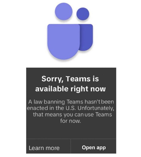
ooh, new dark pattern I discovered today.

Stuck with MS Teams at $DAYJOB, I continue to hold onto the thick-client instead of succumbing to the heavy-weight web client.

Just about every time I switch to the app after a couple hours of not using it, it pops up a "This is unsupported" interruption with a link to learn more, HUGE, colorful "Try it on the web" button, and a smaller light "continue using this antiquated unsupported piece of junk" type button.

As if that wasn't bad enough, as dark patterns go, when you tab through the controls, focus lands on the "more information" link and on the "try it on the web" button, but the "continue using this" simply won't focus with the keyboard. You HAVE to reach for the mouse to click the "continue using this"

Have I mentioned how much I loathe using MS products, and Teams in particular?
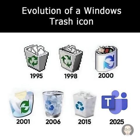
apropos of nothing, this crossed my feed just now

@gumnos

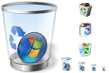
WAIT, did Win2k seriously put the windows logo in the bin??

How did I miss that?

@rl_dane @gumnos shoot, I missed that too until I read your toot
@rl_dane @gumnos nope, there was no windows logo in the trash. Looks like that one was taken from https://www.deviantart.com/glestheartist/art/Windows-Recycled-icons-74520434
Windows Recycled icons by gLesTheArtist on DeviantArt

@rl_dane @gumnos I don't think that's the original full recycle bin icon, but a modified one.

https://archive.org/details/icons_win2k_sp4_en

All Windows 2000 icons in .ico format : aaronk6 : Free Download, Borrow, and Streaming : Internet Archive

All icons from a clean Windows 2000 Professional (SP4) installation.The icons have been extracted from all .exe, .dll, and .cpl files using wrestool (part...

Internet Archive
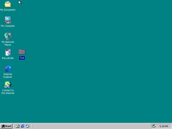
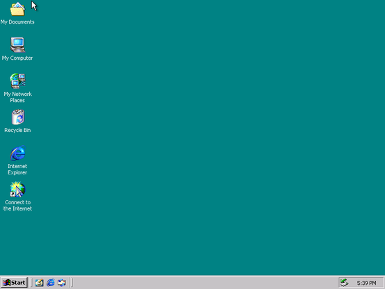
@rl_dane @gumnos I stood up a Windows 2000 Workstation VM and here are the screenshots of an empty and a full Recycle Bin

@qlp @gumnos

Win2k was so clean. I remember seeing the mouse cursor shadow for the first time and thinking that was the coolest thing, ever.

@rl_dane @gumnos Same for me. The rich higher-color icons were also a nice compared to the flat Windows 95/NT 4 icons (I know 98 or 98 SE or the Plus packs had better looking icons, but I didn't really use them).

I also have to say that Tahoma was a really good UI font. It still looks nice and fairly modern today.

Back when I was using FreeBSD with window maangers and apps that supported TrueType (I know, that really dates me), I copied the Tahoma fonts over and used them. Today, IBM Plex Sans is what I use instead (Inter and Adwaita Sans are both nice, but a little too sterile for me).

@rl_dane I'm not a Windows guy, but agree that things peaked with Win2k ☺

*edit: s/thinks/things/ derp* πŸ€ͺ

I think it is an icon and represents an unknown filetype; that is, a file of an unknown type was send to the recycle bin, and the system represents it with the windows logo.

@beckermatic

Yeah, I think @pcyx tracked down the source of this modified icon:

https://c.im/@pcyx/114740948857100508

pcyx (@pcyx@c.im)

@rl_dane@polymaths.social @gumnos@bsd.cafe nope, there was no windows logo in the trash. Looks like that one was taken from https://www.deviantart.com/glestheartist/art/Windows-Recycled-icons-74520434

C.IM

@gumnos Right...

Tomorrow...

... I'm group policy-ing an icon change

@gumnos Someone needs to add Copilot to the set.
@gumnos The 2006 icon is the nicest one.
@gumnos
I really laughed out loud.
@gumnos The sickest burn doesn't exiβ€”

@gumnos I'm one of the dorks who liked Teams and recognized it was way better than the crap we were using at work at the time.

Then Microsoft has been randomly fiddling with shit and bolting on more "functionality" at a ridiculous pace.

It really doesn't need to do everything. I don't need Outlook and Outlook Jr.

@gumnos  Microsoft Teams
  Microsoft Trash