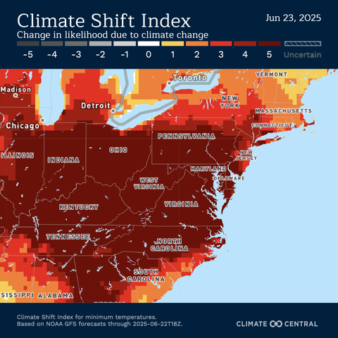
Today's Climate Shift Index (CSI) is highlighting just how much climate change has made today's heat wave more likely to occur, especially for the warm nighttime temperatures.

Follow along with real-time and forecast CSI global maps from Climate Central at https://csi.climatecentral.org/climate-shift-index

@ZLabe The title of the map seems wrong. A change in likelihood is a change in probability, yet the numbers on the map, whose units undefined/unlabeled, our temperature is not probabilities. Same thing when you say “how much climate change has made today’s heat wave more likely to occur.“ Again, likelihood is about probabilities, yet nothing on the map indicates probabilities. I think what you’re meaning to say is something like the map shows how much temperature difference is more likely due to climate change than some sort of local or transitory effect. Not really sure, but it’s really confusing.
Climate Shift Index | Climate Central

Revealing the influence of climate change on local weather around the globe, every day.

@ZLabe Genuinely fascinating graphic.