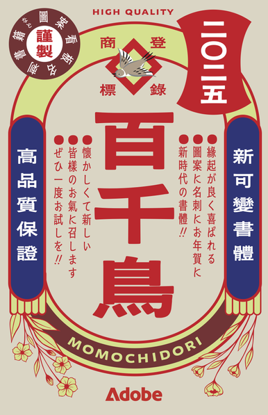
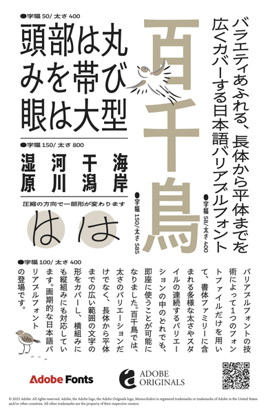
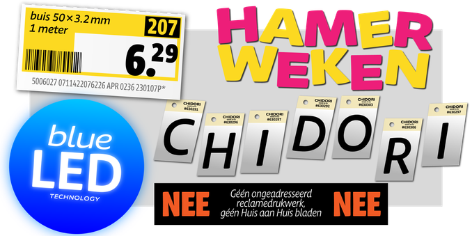
Momochidori (designed by Ryoko Nishizuka and Taisei Yoshida) is a Japanese Variable Font which breaks the notion of the square body: weight- and width axes translate to “short” and “tall” in vertical typesetting.
Momochidori aims to be useful and approachable while recalling the quaintness of the Showa Era – which it does very well! Congratulations Ryoko and Taisei on this remarkable family!
https://fonts.adobe.com/fonts/momochidori-variable
More about Momochidori (in Japanese):
https://main--blog--adobecom.hlx.page/jp/drafts/takada-drafts/iwamoto/cc-design-adobefonts-2502
#ad, I think?
