Sounds like I may get off my ass this year and finally do the #Pride flag fishing shirts I’ve been planning for 2 years now.

I should mention they’d be #tiedye too.

I think I can even pull off progress pride, plan below.

I kinda want to go for broke and attempt intersex inclusive.

Shirt acquired. Need to map out the colors of Rit DyeMore I need to pull this off.

Looks like the magic mix is:

Super Pink
Kentucky Sky
Chocolate Brown
Graphite
Racing Red
Apricot Orange
Daffodil Yellow
Peacock Green
Sapphire Blue
Royal Purple

Walmart had everything but Royal Purple, Michael’s had everything but Kentucky Sky. Hobby Lobby was an oh fuck naw

Picking the Michael's order up today, and I'll backfill anything they couldn't get (some were limited stock) at Walmart.
So for the test shirt, I'm planning a gradient of dots made by placing 2 (or maybe 4) drops from a dropper. In one axis the line would be all colors at the same dilution ratio, and the other axis would be all dilutions of the same color. Just not sure which I want to orient on rows vs. columns.
(Secretly posting this here so that somebody else will check my math)

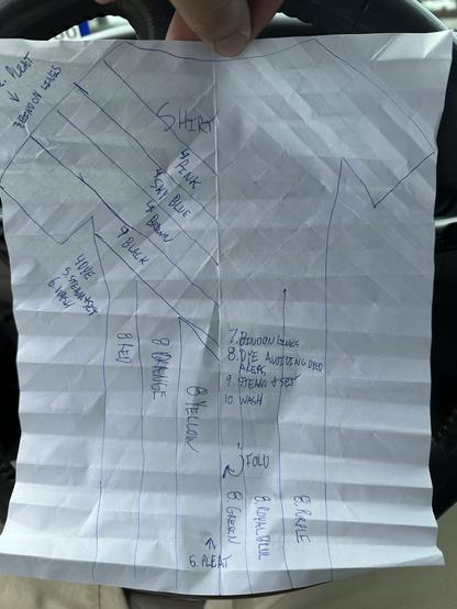
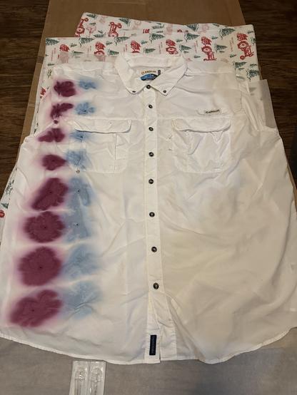
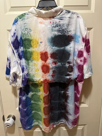
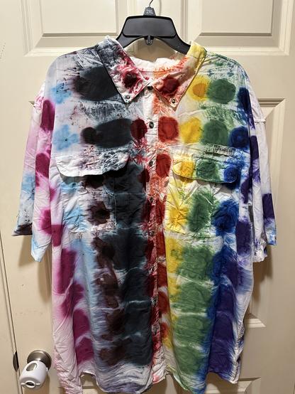
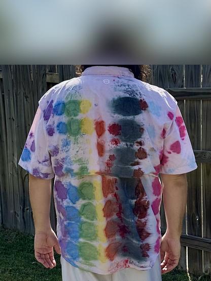
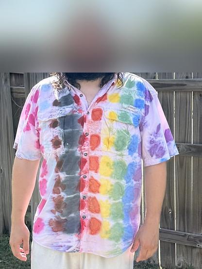
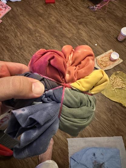
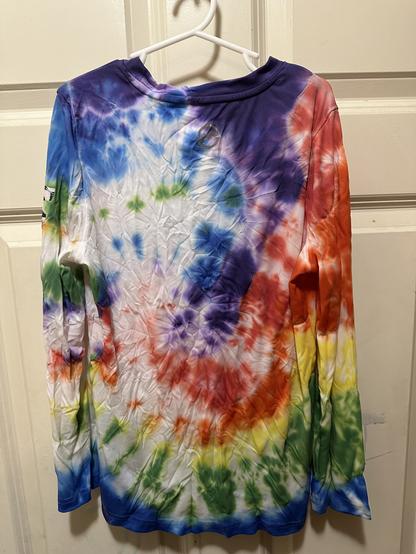
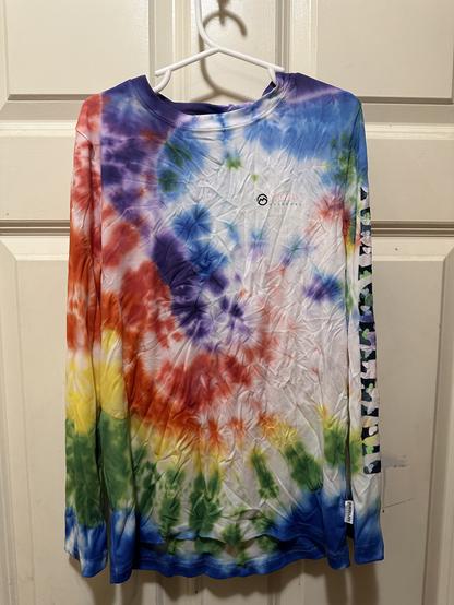
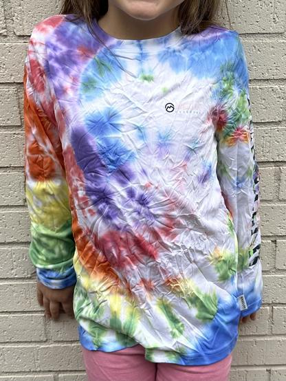
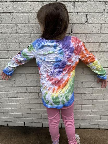
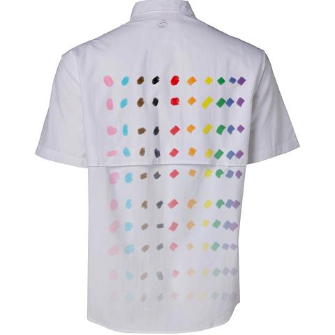
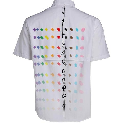
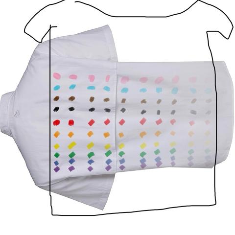
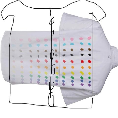
Project #Pride Flag Tie-Dye Fishing Shirt status: 9/10 colors obtained!

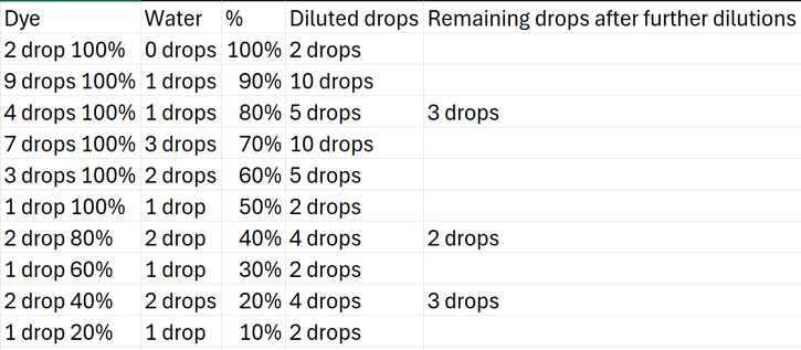
Poll here, do y’all think this would look better with colors on the horizontal axis and dilutions on the vertical (one color per column, same strength per row) or vise versa (same strength per column, different color each row)? Making it approval voting 😉, this is not a FPTP safe space. Keep it open a week, but I may act before then.

If you’ve voted (or not) see the visualizations below!

Responses and boosts for visibility appreciated.

Edit: results here https://infosec.exchange/@ajn142/114650008867964305

Colors change horizontally, strength vertically
72.7%
Strength changes horizontally, colors vertically
27.3%
Poll ended at .
Buttered Jorts (@ajn142@infosec.exchange)

Attached: 2 images After rinse and 2 washes.

Infosec Exchange

I personally think colors horizontally, with 100% at the top and 10% at the bottom would look best on whichever side I start dyeing from, but any bleed through to the other side would be in reverse order, and I think that might hurt legibility on that side.

If I do colors vertically then the order stays the same on the front and back, and it would just vary whether the strongest dot is to the left or right side of the gradient. I feel that’ll be more legible whether somebody sees the shirt from the back or the front.

Paging the #MakeShitMonday crowd to the poll above, since there’s 1 in 7 odds I’ll do this on a Monday 😉
Well, only one vote but I’ve secured all supplies. Probably making this happen tonight, strike while the hyper-fixation is hot.
Correction, not tonight. Kiddo dragged out bedtime for an extra hour, and I burned too much energy on the visualizations while that happened. Instead I grabbed a dial grill thermometer, calibrated it, and added it to the lid of my steamer pot. Now I can more accurately maintain chamber temp while steaming/setting the dye in the material.
So for starters, I went to the store and bought a BBQ grill lid thermometer. I brought it home and noted that it was larger than any drill I had, so I took the nut off the back and used it to make a template on adhesive paper. I stuck this to the lid of my project pot, lining it up with an existing ding in the enamel.
Then I took a 1/16” HSS drill and some 3-in-1 oil, and drilled out the inner perimeter of the template. Then I used my 1/2” bit to drill a hole big enough to fit the tinsnips through, and cut out the rest of the circle.
Finally, I inserted the thermometer through the hole. Not perfectly round, but close enough on size that I had to screw it in. Then I tightened the backing nut, and ta-da, working lid with thermometer.
@ifixcoinops i feel like this is bodging you could get behind.
@ajn142 masterful
@ifixcoinops I’ve realized this thread is more of a tree, so I guess I’ll have to tighten up the readability with a blog post later 😉
So it begins…
I dunno, whady’all think?
After rinse and 2 washes.
Since I made one, my kiddo wants one. Hers will be a more ambiguous rainbow spiral, and she did about a third of the dyeing.
This one is polyester, so it’s getting the same dye strength as the nylon, but steaming between 212 and 200 F for an hour instead.

Some time this week I hope to attempt layout of a real progress pride flag design. I’m expecting it to be kinda difficult though, and require multiple dyeing sessions.

Per the style guide from the designer, there’s a lot of mathematical considerations to get this properly spaced on a shirt.

https://cdn.shopify.com/s/files/1/0589/1676/5845/files/HowToUse-ProgressPrideFlag-DanielQuasar.pdf

I believe I’ll want the light blue and brown stripes to meet at the corners of the shoulders, and the thickness of those stripes needs to be 1/12th of the shirt’s overall width.

And results!

The more saturated photos are straight outta the steamer, the less saturated ones are after a rinse. Wash still pending, and I expect more color to fall out. Probably could have lost less by holding right at 212 F for the hour and flipping the rolled up shirt to ensure both sides heated evenly.

And on our model, after washes. Cropped because I’m not putting my kids faces up here, but you can just see the massive smile she has, because she got to help make this.
Also, enjoy the slightest glimpse of foot ;)
@ajn142 👍🏳️‍🌈👍🏳️‍🌈

@ajn142 interesting. Not what I was imagining. I would totally wear this.

Maybe I need to get crafty myself.

@guamwatt I need to step out and get daylight pics of it. Next go will be trying the pattern to actually pull off a progress pride flag.

Options:

Colors change on horizontal axis, dilution on vertical. I like this most from the primary side, but from the backside the spectrum is flipped and I feel it’s less legible.

Colors change on vertical axis, dilution on horizontal. I like this less than the primary side above, but more than the reverse side, and I like both the front and back equally.
Cc @cR0w for the best visualizations 30 minutes with iOS markup can buy.