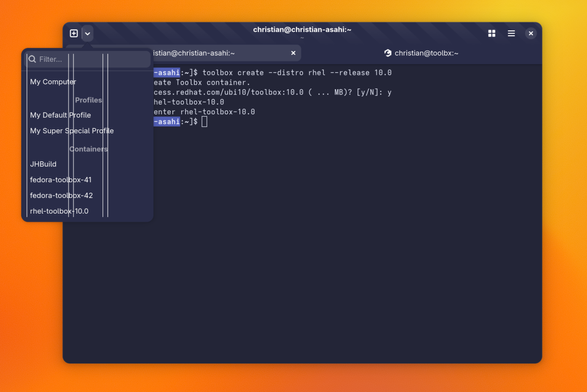
I'm not sure what you mean, but one rule in UX-design is that try to minimise the number of horizontal en vertical lines. When you align everything to the left side, you have one vertical line. In the current design there are five. This way the person who uses the app has to scan the text more, to find out what is on the screen and where things start. If you add a bit more padding to the top of the word Profiles and Containers, it's even more clear that these are category names.