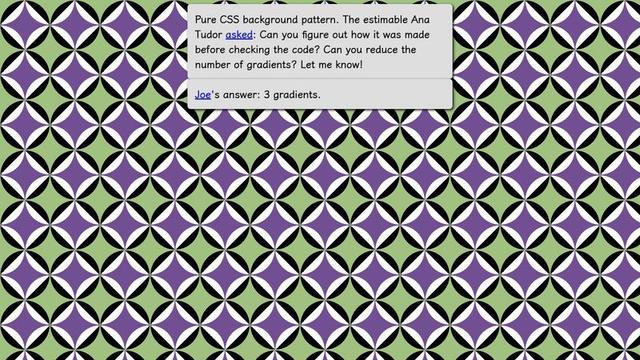
A cool little pure #CSS background #pattern on @codepen https://codepen.io/thebabydino/pen/YzvYqWL

Can you figure out how it was made before checking the code? 😼

#cssPattern #frontend #code #coding #web #dev #webDev #webDevelopment #cssGradient #cssPatterns
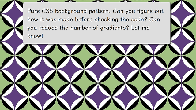
Pure CSS pattern

[Inspiration](https://www.shutterstock.com/image-vector/seamless-geometric-pattern-color-ornament-2128663697). --- If the work I've been putting out ...

@anatudor @codepen I feel like I'm a bit late to this party but my answer: 3 gradients, just one less than yours. But no color-mixing. https://codepen.io/artlung/pen/oggJePp
Pure CSS pattern

[Inspiration](https://www.shutterstock.com/image-vector/seamless-geometric-pattern-color-ornament-2128663697). --- If the work I've been putting out ...

@artlung Psst, https://mastodon.social/@anatudor/112965908316021981

In short: that 1% gap between 69% and 70% may look good on your screen, but not necessarily on others.

Also, closest-side makes things easier:

radial-gradient(closest-side,
#0000 calc(100% - 1px), blue)

(cool idea to paint the outer part leaving middle transparent, btw)

`repeating-conic-gradient()` simplifies things too https://css-tricks.com/background-patterns-simplified-by-conic-gradients/#aa-diagonal-checkerboard

Background Patterns, Simplified by Conic Gradients | CSS-Tricks

For those who have missed the big news, Firefox now supports conic gradients!

CSS-Tricks
@anatudor Intriguing tips I don’t use closest-side typically. As to the 69%/70% I usually would to 69%/0 as the color stops — added the 70% to get closer to your implemention’s spacing. That percent calc minus 1px feels funny but I’ll add to my toolkit. And the successive layers of gradient with parts transparent is my habit borne of doing CSS battles (I’ve done YT videos for all their daily targets) and probably also my brain still thinking like Photoshop 3.0 layers. Fun challenge!

@artlung The ~70% value is 100%/sqrt(2) with the default `farthest-corner`. For this default, when starting from the middle, the 100% is in the corners. On the edges, like needed here, it's 100%/sqrt(2). With `closest-side`, 100% is on the edges and the last stop is by default at 100%, so then I only need to specify the previous one at 100% - 1px to avoid ugly jagged edges as x%/0 would produce.

But I can see why leaving the default & just using % would be preferred for CSS Battle (fewer chars)

@anatudor I sometimes use keyword `circle` in radial gradients on background sizes that are not aspect ratio 1/1. I’ll be experimenting with farthest-corner and closest-side in nonsquare background sizes. Want to feel the effects!

Also: in CSS battles some targets with curves or angles are tough to 100% match from backend. Maybe because backend uses headless Chromium with 800x600 reference png; players code to are a 400x300 viewport; theory is half pixels/aliasing we can’t quite access.