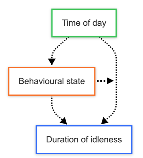
I'm trying to graph out some hypotheses that result from a statistical model with #mermaidjs. Trying to do it kinda DAG-style, but I'd really like to be able to visualise the interactions by having arrows from nodes to edges (see issue on GH https://github.com/mermaid-js/mermaid/issues/3425). Do #stats / #rstats people not do this? Or if so, how/where do you make such graphs? Any examples? I had to add the extra arrow manually for now.