There should be a chapter in The Design of Everyday Things devoted to this dial.

@jameschip
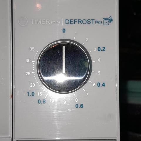
I'd also like to submit this timer knob on a new microwave I bought for my 91 year old Mum.
Pale grey on white that you can only see with the camera flash reflecting off it.
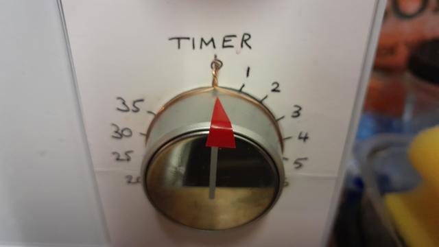
Also, my fix, a cardboard overlay, red pointer, and a wire pointer to remove the parallax errors when looking at a knob that deep with ageing eyes.
Edit for all the typos. (Why do I keep finding more typos!)
@Maker_of_Things @jameschip My favorite design failure is on a heat gun. It has a slide switch labeled Off, Fan, Low, High.
Somewhere between Fan and Low is an unmarked position called Catch On Fire!
No joke. The design of the switch allows an in-between position that powers the heater but not the fan motor, and that will start a fire every time.
@delta
I think there should be a law that designers must be made to install and use their products before they are considered saleable.
I had to install a ceiling light for a client that was a large square plate with spots on. The fitting to the ceiling bracket was screws in a 70mm deep recess above the square plate that was only 15mm from the ceiling. Couldn't see it, couldn't reach it.
@delta @jameschip @Maker_of_Things oh you get those on induction cooking fields as well. Print/touch, textured background. No light problem other than the general one (the ceiling light won’t reach it if you’re standing at it to use it), but if your noodle water cooks over you can’t even turn down the heat or soft-poweroff without getting burnt fingers. Pulling the plug only works for the portable ones.
I lothe all of it and want my gas stove back, despite all the problems with that.
(We have a portable one, but also a Ceran thing which at least has knobs, but it doesn’t know the meaning of low heat.)
@mirabilos
Of yes, so much this!
When Dad got dementia and was at risk of turning the gas cooker on randomly, unlit, we got rid of it and decided on portable worktop cooking rings, as they had proper control knobs unike the built in electric hobs. I wired it into a fused outlet and hid the switch where Mum could find it, but Dad wouldn't know to look.
Fortunately he passed away soon after so part of the risk went with him.
@mirabilos
Thank you.
It was necessary, but also so unnecessary!
I don't know how my parents would have coped with it otherwise.
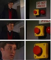
@RnDanger Was there a "Do not" button next to it?
@wonka @RnDanger @mensrea @liferstate @jameschip
"Do" button.
"Do not" button.
There is no "Try" button.
@theVedek That's more like "Un-do", not so much "Do not" 😁
@theVedek Yep. And there is no "try", like Yoda said.
@theVedek @wonka @mensrea @liferstate @jameschip
"Do not undo do, undo do not do."
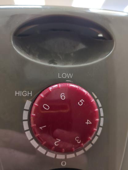
@RobertoArchimboldi @jameschip Sure. As I see it, the 'o' marking at the bottom is the set point, and the dial is currently set to ~2.3 or so. The tapering line and the high/low markings are to give you an idea of which direction to turn it to increase / decrease the setting, and are, IMHO, entirely superfluous and confusing, because for most people, 3 is higher than 2, so if you put the 3 next to the mark, it'll be a higher setting...
Actually, I take back my earlier comment. I don't think an engineer designed this dial... they'd run through the same thought process I just did above, and delete either the numbers on the dial or the tapering line markings. Probably the tapering line, because knowing what it's currently set on (which the numbers give you) is probably more important than just knowing which way to turn it to increase / decrease the setting.
@RobertoArchimboldi @jameschip it's definitely confusing.
A bit like the power setting on my toaster. It goes from 1-6, but ~2.5 leaves the bread black on the outside (and we're not talking particularly dry bread here). Even really moist sourdough is nicely toasted at that point. I struggle to think of a use case for any setting over three...
@Bern @RobertoArchimboldi @jameschip Bidet prompts the same questions from me.
3 gets the job done. 4 starts to get uncomfortable. The dial goes all the way to 10 in case Robocop comes over to use your bathroom.
@Bern Frozen Toast Hawaii sandwiches maybe?
@Bern @RobertoArchimboldi actually this is set to low 6, which it maximum. The 0 at the bottom is just there. We dont know why. To turn it off you rotate the 0 on the dial anti clockwise towards low where it reaches the end of its travel at about the 1 o'clock point.
Nothing about this makes any sense.
@jameschip @Bern @RobertoArchimboldi
Marketing thought it would look cool to add all numbers and stickers and tapers etcetera. Makes it look fancy.
@NicoleTheLizard it turned out I was completely wrong. 😆
That dial is apparently set to the highest setting.
Basically, you can read it two ways to get a correct read:
- look at the number that is at the 1 o'clock point, right of the word 'Low', or
- only look at the position of the number zero on the dial, against the Low->High graduated scale
The 'o' marking at the bottom is pretty much irrelevant, and the two sets of markings are redundant, just confusing the issue.
For clarity, either replace all the numbers on the dial with a marking at the zero position, OR replace the graduated Low-High tapered line with a single marking at the 1 o'clock position (because apparently that's as far as the dial will turn)
@jameschip my wife has degrees in industrial design and design thinking. She referenced Don Norman heavily in her Master's thesis.
I'm scared to show her this.