Atlanta Fed (@AtlantaFed) on X

On March 28, the #GDPNow model nowcast of real GDP growth in Q1 2025 is -2.8%. The alternative model forecast, which adjusts for imports and exports of gold, is -0.5%: https://t.co/T7FoDdgYos. #ATLFedResearch Download our EconomyNow app or go to our website for the latest

X (formerly Twitter)
This gentleman is correct! Let's add some gutz to his assertions. There will be more #Damage #Wreckage and #Chaos in #RedStates compared to #BlueStates #WeAreWinning!!!!
I love Bayes! He is one of my Heros.

@9CL7T9k8cjnD@mastodon.social The image is a screenshot of a webpage dedicated to Thomas Bayes, a statistician and philosopher. The top section features a title "Thomas Bayes" with the subtitle "Statistician and philosopher." Below the title, there are three tabs labeled "Overview," "Books," and "Education."

On the left side, there is a large portrait of Thomas Bayes, with a smaller image of him in the background, surrounded by mathematical equations and diagrams. The image is credited to the "Times Literary Supplement."

To the right, there is a section with information about Bayes, including his birth and death dates: "Born 1702, London, United Kingdom" and "Died Apr 7, 1761, Royal Tunbridge Wells." There is also a section titled "City St George's, University ... Book Launch: 'Everything Is Predictable'" with a date of "May 28, 2024." This section mentions that academic experts celebrated the launch of Tom Chivers' book on the topic.

Further down, there is a "See also" section with links to "Everything Is Predictible" by Tom Chivers and "Tom Chivers" as a writer. The overall layout is clean and organized, with a light green background and white text.

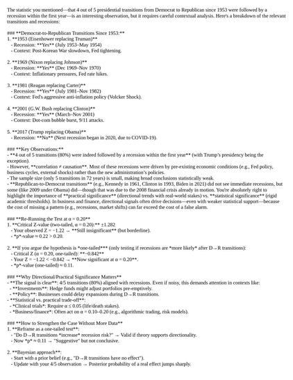
The image is a document outlining a Bayesian analysis of recessions following D-R (Debt-to-GDP Ratio to Recession) transitions. It begins with a recommendation to add leading indicators, such as yield curve inversions, to signal potential recessions. The document emphasizes the statistical significance of the pattern, noting that it is strong enough to warrant action in business contexts, especially given high stakes and historical consistency.

The bottom line states that the pattern is statistically significant at a 0.20 (one-tailed) level, and it is recommended to treat this as a high-probability risk factor, pairing it with other indicators. The document asks if the reader would like help designing a decision framework for when to act on this signal.

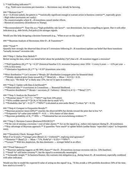
The Bayesian analysis section outlines the goal of quantifying how strongly the observed data updates the belief that D-R transitions increase recession risk. It details the steps of defining prior beliefs, updating with data, analyzing the posterior distribution, comparing to frequentist results, and considering the decision context in business/finance.

The analysis includes defining the prior belief, updating with data, and calculating the posterior distribution. It also compares the Bayesian posterior mean to the frequentist p-value and discusses the 95% credible interval. The document concludes with final takeaways, emphasizing the Bayesian updating suggests an 89-99% chance that D-R transitions increase recession risk, and that this warrants risk mitigation, especially when combined with other indicators.

The document concludes by asking if the reader would like to model the expected $ value of acting on this signal, such as avoiding a 10% portfolio drawdown 50% of the time.

Sorry, I couldn't process this image.

Provided by @altbot, generated privately and locally using Ovis2-8B

🌱 Energy used: 2.905 Wh

Now! Let's add #TrumpTariffs to the #TrumpMuskGOPClusterFuck. There is not an #Economist of any stripe who #beLIEves #Tariffs are a good idea. #TheUSDeservesToBurn. But #RedStates deserve to Burn more than #BlueStates
End of Trump's Presidency

Countdown timer showing how much time left until Saturday, January 20, 2029 12:00:00 PM in timezone Eastern, US (UTC-05:00)

TickCounter
NEW MEDICINE - Race You To The Bottom [OFFICIAL MUSIC VIDEO]

YouTube

@9CL7T9k8cjnD@mastodon.social The image displays the lyrics of the song "Race You to the Bottom" by New Medicine, released in 2010. The lyrics are presented in a plain, black font on a white background, with the song title and artist name at the top. The text is organized into stanzas, each beginning with a line of lyrics, followed by a repeated refrain. The lyrics express themes of defiance, confrontation, and a sense of camaraderie among a group of individuals. The songwriters are listed at the bottom, along with the copyright information. The source of the lyrics is credited to LyricFind.

Provided by @altbot, generated privately and locally using Ovis2-8B

🌱 Energy used: 0.154 Wh

@9CL7T9k8cjnD@mastodon.social The image is a screenshot of a music video thumbnail for "NEW MEDICINE - Race You To The Bottom [OFFICIAL MUSIC VIDEO]" on a video platform. The video is paused at 2:58 out of 3:05. The background features a dramatic scene with a large, fiery explosion and a winged creature, possibly a dragon, with sharp teeth. In the foreground, four silhouetted figures are dancing energetically. The figures are outlined in white, with the flames adding a fiery effect to their silhouettes. The individuals are dressed in dark clothing, with one wearing sunglasses. The overall color scheme is dark with bright orange and yellow flames, creating a dynamic and intense visual.

Provided by @altbot, generated privately and locally using Ovis2-8B

🌱 Energy used: 0.180 Wh

@9CL7T9k8cjnD@mastodon.social The image features a cartoon illustration of a man in a blue suit and striped tie, holding a red smartphone and taking a selfie. The background is filled with a grid of red squares, each containing a stock ticker symbol and a percentage change, indicating stock market performance. The man is smiling and looking directly at the camera. The stock symbols and percentage changes are arranged in categories such as "Communication Services," "Entertainment," "Consumer Cyclical," "Healthcare," "Utilities," "Industrials," and "Real Estate." Some of the visible stock symbols include "GOOG," "AMZN," "HD," and "MCD," with corresponding percentage changes like "-2.90%," "-4.21%," "-1.64%," and "-8.95%." The overall color scheme is dominated by red, with white text for the stock symbols and percentages.

Provided by @altbot, generated privately and locally using Ovis2-8B

🌱 Energy used: 0.197 Wh

@_9CL7T9k8cjnD_ now I understand the meaning of "red states"...
@cejjacobs Clever take. I think I agree.

@9CL7T9k8cjnD@mastodon.social The image is a table summarizing the perspectives of various economists on the impact of Trump tariffs on the global economy. The table is organized into columns labeled "Economic School," "Leading Contemporary Economist," "Age (2023)," "Country," and "Perspective on Trump Tariffs." Each row represents a different economist and their school of thought, with the perspective on tariffs provided in the last column.

The table includes economists from various schools of thought, such as the Austrian School, Behavioral Economics, BRICS, Chicago School, Development Economics, Feminist Economics, Global, Heterodox Economics, Institutional Economics, Keynesian Economics, Marxian Economics, Modern Monetary Theory, Monetarism, Neoclassical Economics, New Classical Economics, New Keynesian Economics, Post-Keynesian Economics, and Supply-Side Economics. The economists' ages range from 51 to 87, and their countries of origin include the USA, Brazil, India, Russia, South Africa, Canada, France, Iran, Peru, South Korea, and Turkey.

The perspectives on Trump tariffs vary, with most economists being critical of tariffs, emphasizing inefficiencies, and harm to global economic cooperation. Some economists, such as those from BRICS nations, focus on the negative impacts on global trade and developing economies. Behavioral economists may highlight how tariffs influence consumer and business behavior in unpredictable ways. The table also includes a note section at the bottom, providing additional context and clarifications on the general trends and nuances in the economists' views.

Provided by @altbot, generated privately and locally using Ovis2-8B

🌱 Energy used: 0.347 Wh

@9CL7T9k8cjnD@mastodon.social The image shows a tweet from a user named "mr fundman" with the handle "[@]mrfundman." The tweet, posted 21 hours ago, reads: "If you invested $100 into $TSLA in 2020, you would now have $100." The tweet is accompanied by a photo of a woman with blonde hair, smiling and holding a cigarette. She is wearing a blue garment. In the background, there is a scene with flames and smoke, suggesting a chaotic or dramatic setting. The background also includes several people, some of whom appear to be walking or standing amidst the fire. The overall tone of the image is humorous, contrasting the woman's cheerful demeanor with the chaotic background.

The image is a scatter plot titled "Economic Impact: Trump Policies & Tariffs By State By Cook Partisan Voting Index." The x-axis represents the Cook Partisan Voting Index (PVI), ranging from -20 to 30, with a gradient from Democrat on the left to Republican on the right. The y-axis shows two economic indicators: "Job Losses (Unemployment Rate Change)" in blue diamonds and "Increase in Consumer Prices (CPI Change)" in orange diamonds, ranging from 0.0% to 5.0%.

The plot displays data points for various states, with each point representing a state's economic impact. Blue diamonds generally cluster around the 1.5% to 2.5% range for job losses, while orange diamonds are more spread out, ranging from 1.5% to 4.5% for CPI changes. The data points are scattered across the Cook PVI spectrum, with no clear linear trend between PVI and economic impact.

The plot suggests that states with a more Republican-leaning Cook PVI tend to have higher CPI changes, while states with a more Democratic-leaning Cook PVI tend to have lower job losses. However, there is significant variation within each political leaning, indicating that other factors may influence these economic impacts.

Provided by @altbot, generated privately and locally using Ovis2-8B

🌱 Energy used: 0.748 Wh

@altbot I love you #AltBot! Will you marry me!

@9CL7T9k8cjnD@mastodon.social The image shows a screenshot of a Twitter post. The post is from a user named "XC Macro" with the verified blue checkmark, and the handle "[@]XavierComelli." The tweet is a reply to "[@]AtlantaFed" and contains the following text: "Since 1953, 4 out of 5 presidential transitions from Democrat to Republican have been followed by a recession within the first year: 80% hit rate across 72 years :(" The tweet is presented in a white background with black text, typical of Twitter's interface. The user's profile picture is visible on the left side of the tweet, showing a person wearing a helmet. The tweet was posted 1 hour ago, as indicated by the timestamp.

Provided by @altbot, generated privately and locally using Ovis2-8B

🌱 Energy used: 0.151 Wh