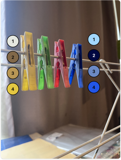
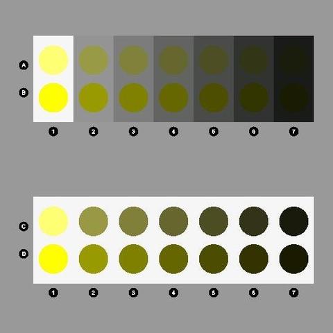
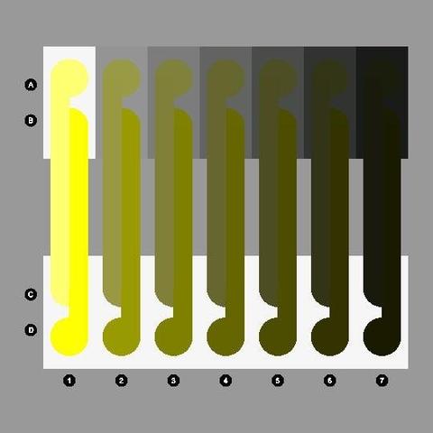
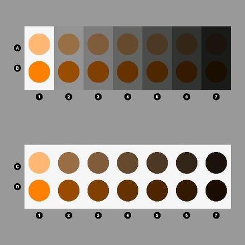
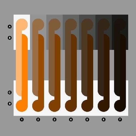
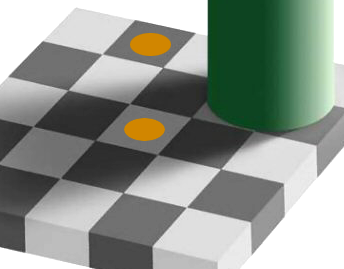
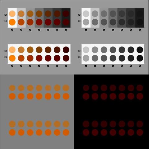
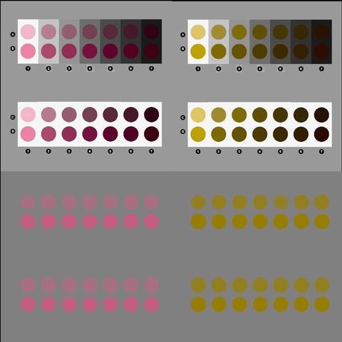
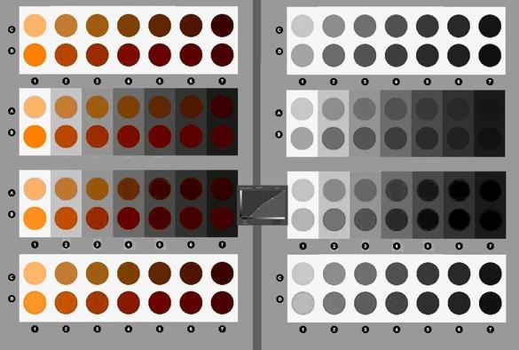
Most folks with "normal" colour vision will say they perceive yellow, green, red and blue pegs hanging on a line here.

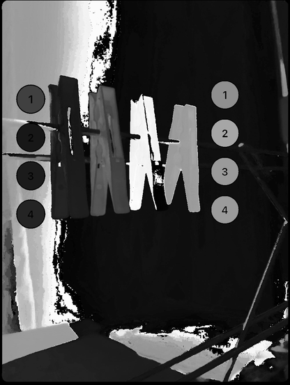
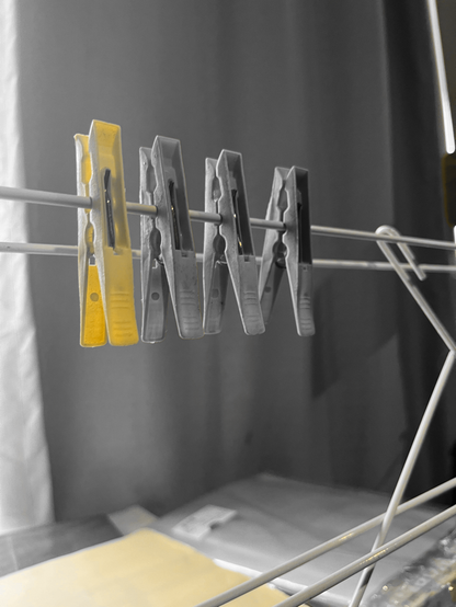
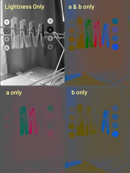
Yet the pixel samples shown along each peg illustrate that not a single point on each peg is "diagnostic" of its perceived body colour.

How do we perceive the pegs as solid body colours despite so much variation in the samples?

Nobody knows, but we can speculate that the visual system somehow integrates the samples to produce a percept of body colour.

An even more challenging question is how we perceive different parts of each peg to be translucent, opaque, shadowed and dirty from the image variations.

@TonyVladusich Asking GIMP to "Colors -> Components -> Extract component -> Hue" gives me this image. Doesn't seem that hard? The wraparound in red is because the channel is defined as starting at red and ending at red, so they are adjacent colors still.

@dascandy

Yeah, it's possible to achieve some level of separation of the chromatic components, although I think it can get messy across colour boundaries, depending on the precision of your system.

For example, in the attached images I've used my own (now defunct) "Colors" MacOS app to separate the hues somewhat. But even here I'd argue that perceptually our visual system "collapses" across variations in chromatic purity and luminance in a manner not captured by any existing algorithm. We somehow see unitary "body" colours despite these variations (we don't misperceive those variations as differences in body colour, such as texture).

And, of course, I think you'd agree no existing algorithm can parse an image into objects with surface and illumination "layers", such as object translucency, shadow, shading, gloss, dirtiness etc, as does our visual system?

@TonyVladusich @dascandy Echoing Tony’s point, try to find forms that vary in form stimuli that cross through the achromatic centroid, yet appear as a chromatic cognition.

It is really echoing Vlad’s point in spades.

@troy_s @TonyVladusich @dascandy

Here's the image broken down to Lightness, a&b, a only and b only...(the a and b are additive over a #555 grey) (Krita Lab)...

It appears to me the majority of of the variation comes from lightness differences, with mostly stable hue. (This then reminds me of the yellow dot checker board illusion.).

This perhaps makes sense considering saturation relates to the perception of luminance and chroma.

If we think about it, aren't "translucency, shadow, shading, gloss, dirtiness" largely luminance? By gloss I assume we mean specular or anisotropic qualities?

I'm not sure Lab is the best model for this deconstruction, but it's readily available in a few image apps.

In the second group, it's a&b only against black, mid grey, light grey, and white. From this it seems there is still a lightness component in the ab channels. Or is it a transparency component?

Does transparency belong with chrominance? I'll venture that this is becoming more relevant with HDR.

@Myndex @dascandy *Not* “lightness”. There is no correspondence between luminance or luma and lightness.

@troy_s @dascandy

Sorry troy I wasn't clear, where I used the term "lightness" I perhaps should have said Lstar instead, as I meant specifically the "lightness" correlate of Lab.

It probably seemed off as I'm talking about both the Lab model and luminance and chroma.

@Myndex @dascandy Yes, but you understand that Lab is nonsense, yes? Luminance does not correlate to “lightness” or “brightness” for obvious reasons.

Look at my example; every code value corresponds to “white” and “black” hues.

We need to abandon these nonsense constructs.

@troy_s @dascandy

Well yea I know, that's been a focus of my work in recent years...!

And I agree Lab is weak--it just happens to be an available way to separate into approximated opponent channels,

I only used for illustration of the effect of luminance on color perception (i.e. yellow vs brown is the result of luminance).

@Myndex My issue with L*whatever is less the whatever, but more that it forces models that have a polemic of some cognitive facet like “lightness” or “brightness”, when the driving force are the neurophysiological gradients, and steepness thereof.

Case in point is yellow vs olive or orange vs brown; it is rather clearly a segmentation-decomposition problem, and *not* a monotonic scale of luminance derived metrics.

@troy_s

YES! My favorite example is DLyon's take on the checkerboard illusion, adding the yellow dots.

@Myndex Yes. My silly example is a riff on Adelson too.

Hence why it all seems enmeshed in a super structure of segmentation-decomposition computations.

EG: We segment-decompose the multiplicative component, leading to a “steeper” decrement gradient than the lower example.

Seems challenging to discuss without paying attention to some global / local polarity interactions.

@troy_s

These examples probably demonstrate more what is wrong with the Lab model.

Equal Chroma Dots:

I modified the orange dot examples, setting the a and b channels so that all dots per row were identical chroma (with the L* channel off).

When combined with L*, there are visible shifts, I think these are likely related to the transforms out of Lab to sRGB.

In the second image the left side is using only the a, and right, only the b channel.

The thing I am wanting to explore more is a model with orthogonally independent correlates for luminance, saturation or chroma, and hue, and also "a practical uniformity, consistent with physical light, within a defined range", like with a display.

The third row of the last image makes only the achromatic L* dots darker, without touching a*b*, attempting to match the dots on white. The top, second, and bottom row all have dots same as original. In the third row, some dots ended up black #000, and we still did not get a match, still needing darker.

@Myndex I think the problem with Lab are way, way, way deeper than that; the entire premise is nonsense.

This can be proven.

The *belief* behind these godawful woeful models is that the model metrics map *bijectively* to cognitions. That is, for every stimuli, there is precisely *one* cognition. If we disprove that, we can disprove all of the rest of the garbage. Proof by negation if you will.

@troy_s

I do agree with all of this, especially that a stimulus definition is not valuable when isolated from the context.

L*a*b* assumes the narrow context of the Munsell environment. You might find amusing the circled sentence on page 6 of the 1967 NIST report on the re-notations: http://www.rit-mcsl.org/MunsellRenotation/MunsellRe-renotations.pdf

And this presents the issue of "how many axes do we need".

Next iteration of APCA includes a third color input for proximal surrounding background. And this is not a complete appearance model, but a practical, simple one, tailored to provide useful guidance for designers, aimed at readability.

If we really wanted to be complete, just for a screen/display, then inputs ought to include:

- Stimulus size/thickness, and intensity.

- Immediate proximal background intensity and width.

- Proximal/surround spatial density and contrast value (e.g. surrounding text)

- Surrounding background intensity (screen adapting field)

- Ambient lighting intensity and diffuseness (environmental).

@Myndex I don’t think we need more dimensions. In fact, the colourimetric idea is probably close, albeit framed incorrectly due to the origin of the Standard Observer model, to the neurophysiological signal.

In suspect the challenge rests in:
1. Shifting to a gradient domain form.
2. Integrating segmentation-decomposition frameworks.

The former is possible, the latter remains ill defined.

@troy_s

The contrast matching experiment we've been exploring attempts to define gradient spacing and take segmentation/gain control into account.